Beer Belly Jellies
Size: 30 pages
My professional status: independent web designer/developer
Website client: Lindy MacLennan
Dates: September - October 2015, with ongoing support until December 2017
Categories: Scoping/pitching/quoting, Client liaison, Project manager, Website designer, Front-end developer, Writing for the web, Content-loader, Responsive web design/dev, CSS-based layout, CSS3, HTML5, WordPress, E-commerce, Small sites
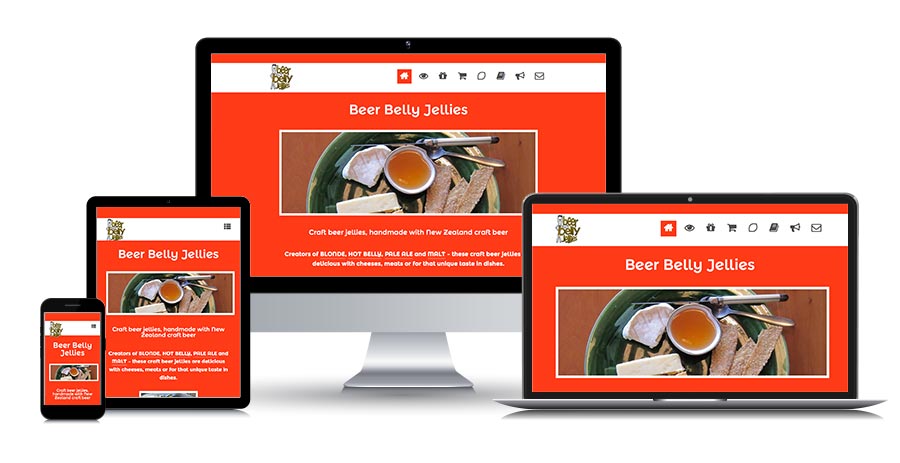
Brief: Beer Belly Jellies was a small business creating craft beer jellies, handmade with New Zealand craft beer. They had had a responsive themed WordPress website built for them a couple of years earlier, which had become a bit messy. It needed a tidy-up and for some of the pages to be redesigned and rebuilt so that they looked nicer and were more user-friendly.
They asked me if I'd be willing to help by identifying some "quick wins" that would improve the look and functionality of the site within a limited number of hours of work.
Boy it's looking so good! What a difference on the stockist page. Many thanks.
Lindy MacLennan, Business Owner, Beer Belly Jellies
Achievements:
- Identifying the quick wins and making the website look so much better without having to start again from scratch
- Showing Lindy how easy it will be to update the website from now on - and how to add value by incorporating her Facebook posts as well.
My responsibilities included:
- Client liaison and project management
- Identification of quick wins that would improve the look and functionality of the website within a very limited timeframe - initially 3 hours, later extended to 7
- Exploration of the existing responsive WordPress theme, making a copy of the site in my WP hosting environment in order to figure out how the theme worked and to identify inbuilt theme functionality that the site wasn't currently using
- Improving the formatting of the Homepage, while retaining most of the existing homepage design
- Tidying up the formatting of the Products section
- Completely rewriting, redesigning and reformatting the Gift packs page to make it much clearer and more user-friendly, and adding a purchase form so that visitors could order gift packs much more easily
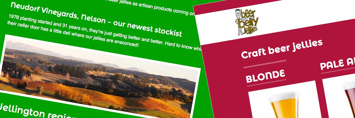
- Completely redesigning and rebuilding the Stockists page and ensuring that it looked good from a responsive perspective within any viewport size
- Rebuilding the Recipes and News sections as blog posts, separated in the main nav by the use of category links
- Reformatting the recipes and remaking the recipe images so that they were all consistent with each other
- Tidying up and tweaking the formatting of the About us and Contact us pages
- Creating standard Photoshop templates for the different image types on the website - including the homepage, stockists and recipe images - to keep the consistently the same size and shape to improve the look of the site
- Extensive browser and device testing of my updates on the live site, to ensure that everything looked good and was behaving properly from a responsive perspective
- Providing Lindy with training on how the new Stockists page was structured, so that she could continue to add new stockists to the page without breaking it (it's fairly complex as CMS pages go - needs to be edited in HTML mode)
- Encouraging Lindy to start incorporating her Facebook posts (which are very impressive) into the website's News section - and showing her how quick and easy it is to cut and paste from Facebook into the website
- Ongoing support and help with the site, as and when required.

What a cute little website. I really enjoyed working on it.
I love getting the opportunity to check out a WordPress theme I haven't seen before, and to assess how well it's been built from a developer's perspective. It never ceases to amaze me how many different ways theme developers can get WordPress to work for them - and it's always fun to try and get inside their heads and figure out how it all works.

