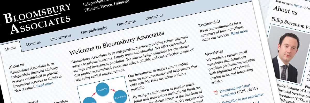
Bloomsbury Associates (2010)
Size: 4 templates for a 16-page website
My professional status: independent web designer/developer
Website client: Bloomsbury Associates
Dates: October - December 2010, with ongoing support until 2018
Categories: Scoping/pitching/quoting, Client liaison, Project manager, IA & UX, Website designer, Front-end developer, Content-loader, Webmaster, CSS-based layout, jQuery/JavaScript, HTML email, No CMS, Small sites
Brief: Bloomsbury Associates is an independent financial advisory practice established to provide investment services to clients in New Zealand. They wanted a website that would provide general information about their services and their philosophy, together with case studies and testimonials from existing clients.
Lovely, thanks for your hard work Ali. Everything looks great, works and is very quick... I have had excellent feedback on the website from clients and also from those in the industry - nice to see the directors of large multinational corporates getting jealous of what you've built for me!
Philip Stevenson, Director, Bloomsbury Associates Limited
My responsibilities included:
- Writing and negotiating the proposal for the website fixed-price contract
- Creation and refinement of the information architecture and site schematics, including template wireframes and sitemap
- Project management and ongoing liaison with the Bloomsbury team in order to achieve all their aims for the site, and to work through a range of technical and implementation issues with them
- Project management including the development of design/development timelines within a programme of work and ensuring that I achieved all my project milestones in a timely fashion
- Ongoing project management once I had designed, built and integrated the website in response to client requests for new and/or altered content and new functionality
- Development of a website brand, including graphics and colour palette - as the existing branding consisted of a logo and newsletter in black and white
- Design of the site - including look & feel, graphics, and navigation - initially by providing two different designs and then by refining and extending the client's preferred design
- Development of a set of 4 templates in CSS and HTML 4.01 Transitional, from which I built and content-coded the completed website
- Hand-coding in HTML 4.01 Transitional to a reasonable level of accessibility
- Incorporating dynamic graphical effects using jQuery (Shadowbox plugin)
- Ensuring that the jQuery provided progressive enhancement while still allowing complete accessibility for those users with JavaScript disabled
- Extensive testing of the site at all stages of the development process, ensuring complete consistency across the following browsers and platforms:
- PC Windows7: IE8; Firefox 3.5, Chrome
- PC WindowsXP: Internet Explorer IE6, IE7, IE8; Firefox 3.0, 3.5, Chrome
- Mac OSX 10.6: Firefox 3.5, Opera, Safari
- The creation of a sitewide CSS print stylesheet - tested in IE6, IE7, IE8, Firefox, Opera and Safari
- Ensuring that every template had been validated using the W3C Markup Validation Service and that it conformed to HTML 4.01 Transitional requirements
- Ongoing liaison with the client to ensure that the site was working as expected, and to provide additional HTML, CSS and content graphics as required
- A final QA check of the website before go-live, ensuring that it was absolutely perfect, and then putting the site online and re-testing.
The main aim of the Bloomsbury Associates website is to provide a first point of information for potential clients who have been recommended by third parties - and as such it needed to be easy to navigate, simple, to-the-point and with a clear message. This was an enjoyable project - particularly developing the design - which needed to invoke a feeling of sensible, trustworthy, careful and professional financial advice through the use of colours and graphical elements throughout the site.
I continue to update the website on an ongoing basis for the client, as and when required. Over the last couple of years I've developed HTML emails for Phil, which he sends out quarterly to his clients. I use Campaign Monitor, which is an excellent tool. My latest design iteration is based on Phil's updated newsletter layout and styling, and produces fully responsive HTML emails.

