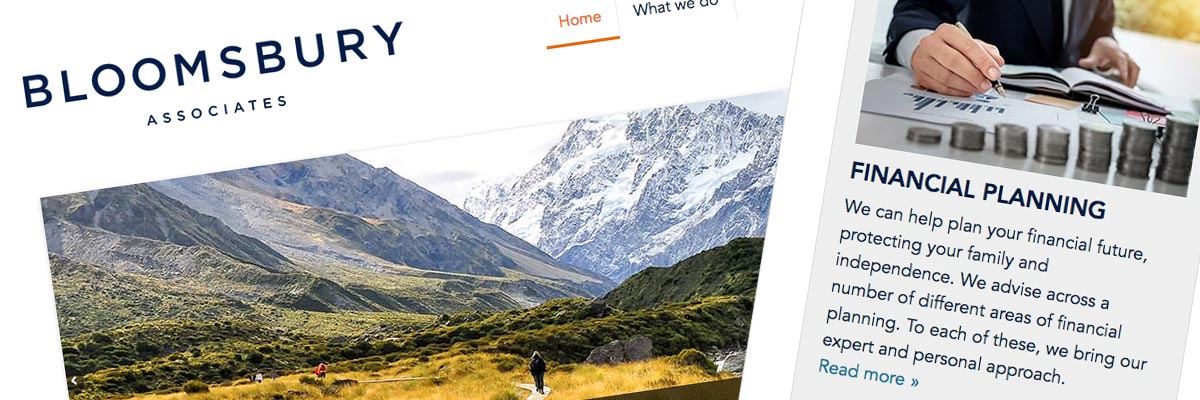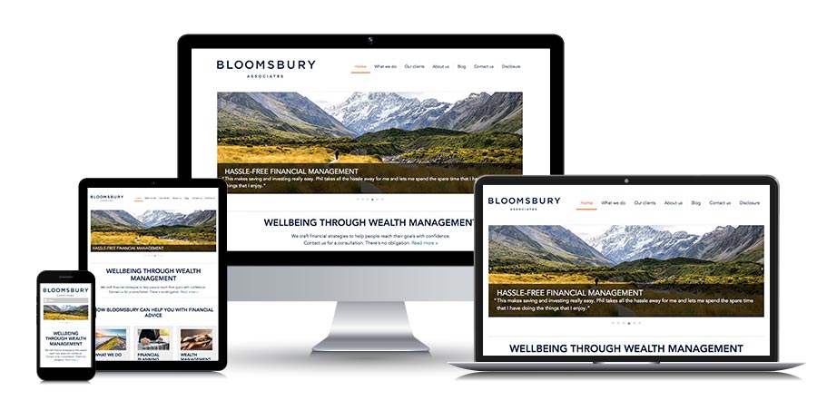
Bloomsbury Associates (2018)

Website: bloomsbury.co.nz
Size: 8 Dreamweaver templates for a 27-page website
My professional status: independent web designer/developer
Website client: Bloomsbury Associates
Dates: February - July 2018, with ongoing webmaster support after delivery
Categories: Scoping/pitching/quoting, Client liaison, Project manager, IA & UX, Website designer, Front-end developer, Writing for the web, Content-loader, Webmaster, Responsive web design/dev, CSS-based layout, CSS3, HTML5, jQuery/JavaScript, HTML email, Dreamweaver templates, No CMS, Small sites
Brief: Bloomsbury Associates is an independent financial advisory practice established to provide investment services to clients in New Zealand. In 2010 I designed and built their first website, and have been taking care of it ever since. An office relocation in 2018 combined with a redesign of their logo and branding was the perfect opportunity to create a new, responsive website for them. This was something I'd been wanting to do for quite a while, and something we had already discussed.
The website provides general information about Bloomsbury's services, together with case studies and testimonials from existing clients, a quarterly newsletter and an initial consultation request form. All the content was new, written especially for the website by Amanda Woodbridge and Kirsty Fyfe from Matai Partners. I liaised with them and together we worked on creating the perfect marriage of website design and content for the new site, taking inspiration from the new logo, typeface and branding colours from Scratch Design.
Thanks – looks great!
Philip Stevenson, Founder and Principal Adviser, Bloomsbury Associates
Achievements:
- Providing Phil with a cost-effective starting-point for the website, which was actually a fully developed and content-loaded site for a different client who had changed their mind about the whole thing at the last minute. I used the design and responsive templates from that site as my starting-point, and incorporated the new logo, colour palette, typeface and design elements from Scratch into the design. By the fourth iteration of the re-design, we had our new website.
- Working closely with Amanda and Kirsty at Matai Partners to ensure that my design and their words blended beautifully into a website where the design and content meshed perfectly. This included providing them with my ideas about the content I found valuable in the existing website, and suggestions about how this might be incorporated in the new site, as well as discussions about the amount of content - literally: how many words - should go into each page and template type.
- Producing a beautifully minimalist design and build using Dreamweaver (no costly CMS required for this site) and, with the help of fabulous New Zealand scenic hero images from iStock and NZ Story, making something that feels beautiful, and colourful, and trustworthy. I'm really proud of it.
- Incorporating a full set of new case studies and a whole lot of new testimonials into the website - and writing a couple of pieces of JavaScript to display a random testimonial on each page, and a pair of random testimonials on the homepage. I'm not an expert JavaScript author at all, so I figured it out as I went along, teaching myself a bit about JS programming at the same time.
- Creating a matching e-newsletter template in Campaign Monitor, based on a rebuild of my original CM template, restyled and rebuilt to match the new website.
My responsibilities included:
- Providing Phil (the client) with a range of different options and rough costings for the new website, from a redesign of the existing templates, via a new responsive Dreamweaver site based on another unused set of templates, through to a completely new site built in WordPress or SilverStripe
- Refinement of the information architecture and site schematics, commenting on and developing the initial sitemap suggestions from the client
- Project management and ongoing liaison with the Bloomsbury team in order to achieve all their aims for the site, and to work through a range of technical and implementation issues with them
- Ongoing liaison with the web content writers, including answering questions about best practice web design and development; discussing content in relation to design, layout and formatting; and making suggestions about content I thought should be included
- Project management including overseeing progress within the overall programme of work and ensuring that I achieved all my project milestones in a timely fashion
- Ongoing project management once I had designed, built and content-loaded the website in response to client requests for new and/or altered content and new functionality
- Design of the site - including look & feel, graphics, and navigation - initially based on an unused website design for another client that I re-purposed and into which I incorporated Bloomsbury's new logo, colour palette, typeface and branding
- Initially adding mockup content to the re-purposed templates so that the client could decide whether the design would work for them
- Development of a set of eight Dreamweaver templates in CSS3 and HTML5, from which I built and content-coded the completed website - based on the original four templates from the re-purposed site and adding four more specifically for Bloomsbury
- Hand-coding in HTML5 to a reasonable level of accessibility
- Restyling and tweaking various elements of the original design to improve it and to bring it into line with the new content that was being written at the same time
- Working with Kirsty to put together a collection of New Zealand scenery-based photographs from iStock and NZ Story that we could use as hero images on each page of the site, and which would provide metaphorical meaning as well as colour and beauty to the website
- Using jQuery to build and control the homepage slider
- Writing two JavaScript widgets to display a random testimonial on each page, and a pair of testimonials (matched in length to keep the formatting tidy) for the homepage - teaching myself some JavaScript programming in order to do this
- Using @font-face to serve the Avenir font family to site visitors
- Various types of more recent CSS3 coding and styling including Flexbox, and ensuring that this coding was fully responsive and that fallback styling for earlier versions of IE and Safari in older iOS environments was included
- Content-loading and formatting the entire site by hand in Dreamweaver - and proof-reading the new content from Matai Partners before I added it to the site
- Reviewing and providing a practical critique of an e-newsletter template design suggested by Scratch Design - taking some elements from this design and incorporating them into the design of the newsletter page on the website and the accompanying redesigned e-newsletter
- Rebuilding our existing e-newsletter template in Campaign Monitor to match the new website design as closely as possible, including experimenting with (and deciding not to use) e-newsletter @font-face techniques
- Doing extensive testing and tweaking of my new responsive e-newsletter template in Campaign Monitor, aiming to produce a near-perfect result in every email platform
- Extensive testing of the website at all stages of the development process, ensuring display consistency and correct responsive functionality across the following browsers and platforms:
- PC Windows: Internet Explorer IE9, IE10, IE11, Edge (latest); Firefox (latest), Chrome (latest)
- Mac: Firefox (latest), Chrome (latest), Safari (latest)
- Extensive device testing to ensure that the responsive aspects of the site were working beautifully in as wide a range of devices as possible, including:
- Actual devices: iPhone 6s, iPad Pro, Samsung Galaxy Mini Pocket S5300 (Android 2.3), Samsung Galaxy Ace 2 I8160 (Android 2.3.6), Samsung I9100 Galaxy S II (Android 4.1), LG C900 Optimus 7Q (Windows Phone 7), Nokia Lumia 710 (Windows Phone 7.5)
- Devices on BrowserStack: iPad Air (iOs v7 Safari), iPad Air 2 (iOs v8 Safari), iPad Air 2 (iOs v8 Chrome), iPad Pro (iOS v11 Safari), Samsung Galaxy S5 (Android 4.4), Samsung Galaxy S8 (Android 7), Samsung Galaxy S9+ (Android 8), Nokia Lumia 630 (Windows phone 8.1)
- The creation of a sitewide CSS print stylesheet - tested in IE9, IE10, IE11, Edge, (PC only) Firefox, Chrome (Mac and PC) and Safari (Mac only)
- Creating a full set of touch icons and favicons for the site
- Ensuring that every template had been validated using the W3C Markup Validation Service and that it conformed to HTML5 requirements
- Ongoing liaison with the client to ensure that the site was working as expected, and to provide additional HTML, CSS and content graphics as required
- Generate a sitemap file and submit to Google site manager, update Google Analytics code
- A full QA check of the entire website before go-live, ensuring that it was absolutely perfect, and then putting the site online and re-testing.

I love this website, and I think the design works really well. It's clean and simple, and yet the photos help to make it quite beautiful. I think it emanates a feeling of calm, and trustworthiness, and all-round accessibility. I'm proud of it.
The writing by Kirsty and Amanda at Matai Partners is excellent, and adds great value to the site. I'd be really happy to work with them again. They were fab.
Bloomsbury Associates and I have been working together since 2010. In that time we've become friends as well as each other's client. I'm very happy to have been able to provide such a lovely new website for Phil - and I look forward to being the site's webmaster for many years to come.
Search Engine Optimisation (SEO) update
In 2020 Bloomsbury Associates engaged the services of a specialist Search Engine Optimisation company. Phil's wish was to get to page 1 of Google search results (haha!) and we knew we could make some improvements to our search engine ranking. Search Engine Optimisation can be a bit of a dark art, but there were many elements we had already included, which gave us a head start.
As there are so many SEO cowboys out there, I offered to "vet" the company before Phil signed an agreement with them, to make sure they were the real deal. They passed my quite exhaustive interview questions with flying colours, and I was able to reassure Bloomsbury that their investment would be worthwhile.
The SEO advice included a few more techniques we could put in place to climb the Google ladder. These included tweaking the content in a couple of the website sections, and adding a couple of new pages that focused on the highest-value keywords potential clients were using when searching for a financial adviser. They also suggested we incorporate some other specific keywords into various paragraphs of existing content on other pages.
The company supplied us with a basic set of wireframes, which I expanded to show "before" and "after" layouts, along with a couple of my own suggestions for sections of the site which hadn't been considered. Once these were agreed, I updated the website's information architecture and page layouts, and added the new content. I also took the time to add a set of navigation tiles to each page, linking sibling pages to each other in a more consistent and user-friendly way.
I updated and improved our canonical links and ensured that our meta tag descriptions and page titles were up-to-date and of the optimum length. I also updated our XML and HTML sitemaps and re-submitted these to Google.
After the work was complete, we invited a different SEO company to do a Google Domination Score Audit on the updated website. Our score was 86/100, with an overall rating of Excellent.
