Clean Edge
Website: not online - view screenshot
Size: 23 template pages
My professional status: employee at Shift
Website client: Clean Edge
Dates: December 2007
Categories: Front-end developer, CSS-based layout, jQuery/JavaScript, ExpressionEngine, E-commerce, Medium sites
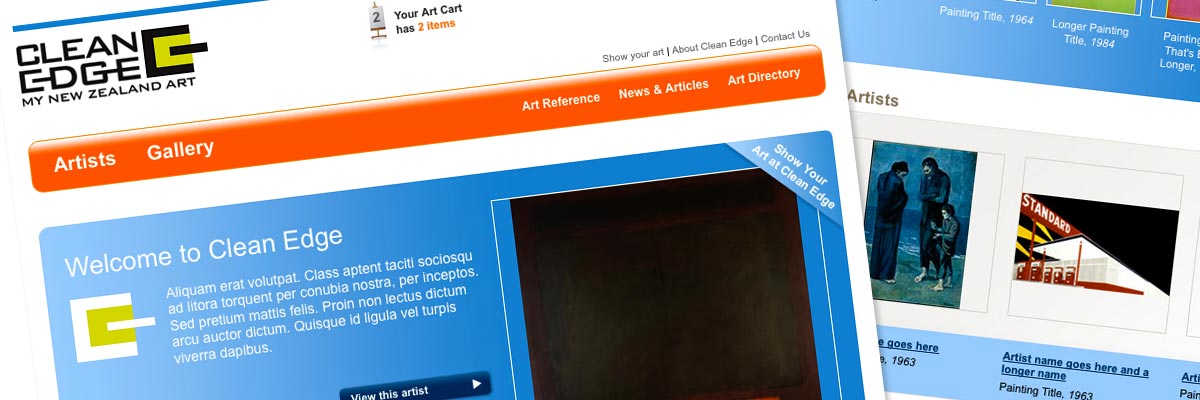
Brief: to build a set of template pages for the new Clean Edge website. Clean Edge was to be an online art gallery where New Zealand artists could display their work for sale online. The design was done by a colleague at Shift, and my job was to build the templates and prepare them for integration by my Shift colleague Tom St George into the ExpressionEngine CMS.
My responsibilities included:
- Development of the site in CSS and HTML 4.01 Transitional, which would then be integrated into the ExpressionEngine CMS
- Creation of various dynamic visual effects and user interface elements using the script.aculo.us JavaScript library
- Close liaison with Shift programmer Tom St George in order to ensure that he could easily integrate my templates into ExpressionEngine
- Hand-coding in HTML 4.01 Transitional to a reasonable level of accessibility
- Extensive testing of the site at all stages of the development process, ensuring consistency across the following browsers and platforms:
- PC: Internet Explorer IE6, IE7; Firefox
- Mac: Firefox, Netscape, Opera, Safari
- Ensuring that every template and stylesheet had been validated using the W3C Markup Validation Service and that it conformed to XHTML 4.01 Transitional requirements
- Development of print stylesheets sitewide.
The Clean Edge project was an interesting challenge. It incorporated a range of dynamic visual effects including super-nav and search sections which were revealed via a mouse click, dynamic image galleries and lightbox functionality. This was my first JavaScript library website, and we worked with script.aculo.us, which I taught myself how to use. The design for the lightbox display was somewhat different from the standard lightbox interface, so I restyled it (which isn't as easy as it looks!).
The most interesting design challenge was a requirement that every painting on the site must be displayed in the absolute centre (vertically and horizontally) of a bordered container. This was actually extremely tricky, because the styling had to work, even in IE6 and IE7, regardless of the size of the image. Having endlessly and fruitlessly Googled to find out if anyone else had figured out how to do it, I invented my own method - which utilises one technique in compliant browsers such as Firefox and another in IE6 and IE7. I really must do a write-up of the technique for my blog, because I'm pretty sure it's a completely new solution.
Sometime after I had completed the templates the website project was put on hold indefinitely, and I'm not sure that it ever saw the light of day. Which is a shame, because it was a really nice design.

