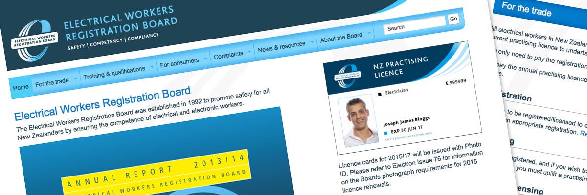
Electrical Workers Registration Board
Size: 9 templates for a 50+ page website
Government status: Government Agency
My professional status: Web consultant with Insight Consultants Ltd
Website client: Electrical Workers Registration Board and the Ministry of Business, Innovation and Employment
Dates: July - December 2013
Categories: Scoping/pitching/quoting, Client liaison, Project manager, IA & UX, Website designer, Front-end developer, Govt web standards tester, Writing for the web, Content-loader, Responsive web design/dev, CSS-based layout, CSS3, HTML5, jQuery/JavaScript, e-govt/WCAG compliance, SilverStripe, Government websites, Medium sites
Brief: the Electrical Workers Registration Board was established in 1992 to promote safety for all New Zealanders by ensuring the competence of electrical and electronic workers. All electrical workers in New Zealand must hold both a registration and a current practising licence to undertake prescribed electrical work. The work of the Board is overseen by the Ministry of Business, Innovation and Employment (MBIE).
Their old website was very old and out of date, and desperately needed an upgrade. Insight Consultants was invited to pitch for the job of designing a new site, which was to be built using an instance of the Government's new Common Web Platform (CWP) in SilverStripe as a starting-point. Insight's longstanding working relationship with MBIE and the fact that they had already been tasked with producing a new logo and branding for EWRB, meant that they were perfectly placed to carry out this work.
I was asked by Chris Payne, Insight's Director, to work alongside his team as their resident web consultant. I was responsible for helping with the initial pitch/quote, wireframing including responsive UX design, and advising the designers how best to design the website within the framework of the CWP. I then developed the design across a range of breakpoints, and built the templates in HTML5 and CSS3 (designing the responsivity in-browser as I built). I was responsible for browser and device testing and I was also asked to do a thorough proof-read and QA of the site prior to launch.
Thanks for the update Ali, I’ve been enjoying the stream of one way messages regarding bugs and fixes... It is just about impossible for people without a deep knowledge of the product to QA this part of the task as you are doing, but without this discipline the end result is disappointing.
Simon Wagg, Senior e-Business Advisor, Ministry of Business, Innovation & Employment
Today more so than ever before you have made good on my confidence to engage specialist services. Keep up the good work. Maximum respect.
Achievements:
- Successfully translated the original desktop designs into responsive ones through the use of detailed responsive wireframes and browser-based responsive design techniques
- Guided an initially mistrustful Board through the process of designing their new site, involved them in decision-making and kept them informed - resulting in a successful design/build that was approved and signed-off by the Board members
- Delivered the completed website to the client ready for content-loading within a very tight timeframe
- Provided the client with a thorough and detailed QA review of the content-loaded website just before go-live, using my detailed knowledge of the website to achieve this.
My responsibilities included:
- Helping to write the original website proposal and quote document
- Putting together a project timeline, working out how we could achieve all our tasks within a very tight timeframe
- Attending planning meetings with MBIE, members of the Board, and representatives from SilverStripe and Insight Consultants
- Discussing the results of the Chalkmark user testing with Chris Payne at Insight, and incorporating the sitemap drawn from the testing into my wireframes
- Constructing wireframe diagrams using Balsamiq for each of the standard templates provided in the SilverStripe Common Web Platform (CWP) instance, giving myself an overview of our starting-point so that I could understand how it was all put together
- Constructing wireframe diagrams for the nine templates we had identified in the original quote
- Constructing responsive wireframe diagrams for two of our templates at five different breakpoints (matching the SilverStripe ones), and doing the responsive UX design at the same time
- Providing a couple of possible different examples of homepage layouts as wireframes so that the Board could choose the one they liked best
- Providing guidance for Insight's web designers in terms of how they might tackle the design with the starting-point of the original CWP templates, and in relation to the wireframes and UX design I had already done
- Once it had been signed-off by the Board, extending the design to incorporate responsivity - initially across the five breakpoints provided in CWP, and then expanding across other breakpoints determined by our content and overall design
- Building nine responsive templates in HTML5 and CSS3, using static copies of the CWP templates as a starting-point
- Tidying up the CSS stylesheets that came with the CWP instance - these were based on Bootstrap and contained loads of styles we didn't need, and some styles that were replicated across multiple stylesheets
- Ensuring that the templates were e-govt compliant and conformed to government web standards for accessibility, hand-coding in HTML5 to a very high level of accessibility, aiming to incorporate as many WCAG 2.0 AA requirements as possible
- Incorporating dynamic graphical effects using jQuery for a range of elements including dropdown menus in the main navigation, subnavigation accordions for smaller viewports and responsive tables
- Programming the jQuery to provide progressive enhancement while still allowing complete accessibility for those users with JavaScript disabled
- Extensive browser testing of the site at all stages of the development process, across the following browsers and platforms:
- PC: Chrome (latest), Firefox (latest), Internet Explorer IE6, IE7, IE8, IE9, IE10
- Mac: Chrome (latest), Firefox (latest), Safari (latest)
- Extensive device testing at all stages of the development process, across actual devices running the following operating systems, using Adobe Edge to help speed up the process:
- Android 2.2 (Froyo)
- Android 2.3 (Gingerbread)
- Android 2.3.6 (Gingerbread)
- Android 4.0.4 (Ice Cream Sandwich)
- Android 4.1 (Jelly Bean)
- iPhone 3
- iPhone 4s
- iPad 4
- Windows Phone 7
- Windows Phone 7.5
- Windows Phone 8
- Windows 8.1 (Surface RT tablet)
- BlackBerry OS 6.0
- Firefox OS
- Additional responsive testing:
- Using Firefox to emulate different device widths - every pixel width tested from 0 to 1500px
- Using Chrome to emulate a range of other hand-held devices, filling the gaps in my own device collection
- Ensuring that every template had been validated using the W3C Markup Validation Service and that it conformed to HTML5 requirements
- The creation of a sitewide CSS print stylesheet - tested in IE6, IE7, IE8, IE9, IE10, Chrome, Firefox and Safari on PC and Mac
- Handover of competed templates to SilverStripe, whose job it was to re-integrate these back into the CMS, and ongoing monitoring of their progress
- CMS/site testing after integration, to ensure that the CMS was working properly and was ready for the MBIE web editors to add content
- Compilation of a bug-fixing document for SilverStripe, listing the range of bugs and alts that needed to be done post-integration, explaining what needed to be done, keeping track of these and ensuring that all the fixes had been completed
- Building a skeleton site for EWRB once the templates had been integrated and creating sample reference pages for the web editors
- Helping the MBIE web editors with content-loading and formatting during the very tight content-loading period at the end of the project
- Doing a thorough QA check of the website prior to launch, including fixing bugs and content errors and providing an ongoing summary of these by email to the MBIE project manager.

This was an interesting project. A few months earlier we had worked with the MBIE project manager, Simon Wagg, on the Licensed Building Practitioners website, and so we were happy to pitch for this job. The website used one of the first instances of the new Common Web Platform - a set of templates and stylesheets built within the SilverStripe CMS - and it was the first time that I had worked with the CWP.
The website is aimed at three quite different audiences - electrical tradespeople who need to get registered; the general public who want to find out when and how they should be using registered electrical workers; and trainees, students and apprentices who are considering becoming registered electrical workers. This can sometimes lead to a delicate balancing-act when it comes to the IA and content structure, and I was able to use my experience with other multiple-audience sites such as Master Plumbers to help navigate this successfully.
Chris and Simon ran a series of Chalkmark user tests to determine how the IA should be structured and what labels to use for various sections and sub-sections, and I used the website sitemap they came up with as the basis for my wireframes.
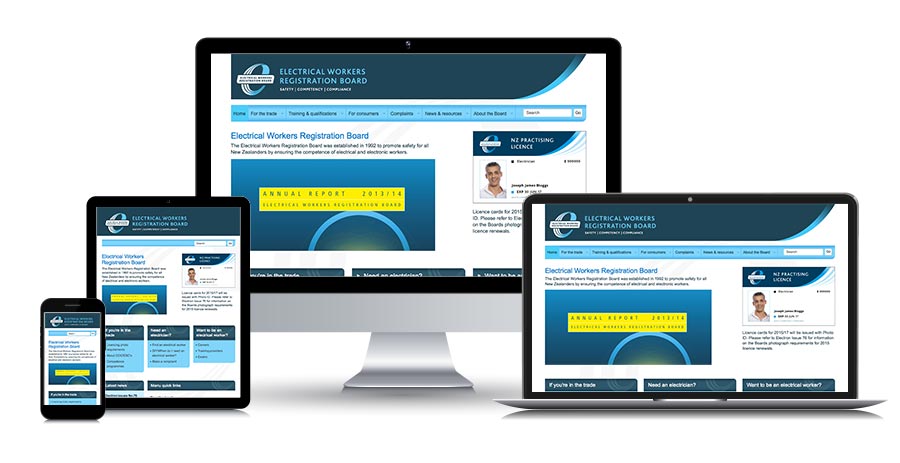
The website was responsive, and I was responsible for taking the standard desktop-sized designs and making these responsive. I began this process via my initial wireframes - drawing up the homepage and detail page templates at five different breakpoints - with the majority of the responsive design being done in-browser as I was building the templates themselves.
I found the process of first drawing up wireframes for the existing CWP very helpful, as it allowed me to get my head around how it was built, how it worked, what templates we could use as starting-points and which templates were missing and needed to be built from scratch.
Our relationship with the Board was very important. We spent time meeting with them and communicating by phone and email, explaining the process, and addressing their concerns. This included involving them in decision-making from very early on, for example when we invited them to discuss and debate the merits of various UX designs for the homepage. Some members of the Board strongly wanted lots of white space and very little else on the homepage, whereas we felt that it was important to use the homepage as a signpost to all the main sections and sub-sections of the site. By working through these issues together, we were able to come to decisions that everyone was happy with, and which the Board were comfortable signing off.
By the time my templates had been integrated back into the CWP by the integrators at SilverStripe, there was very little time left for content-loading, so I helped the MBIE web editors to do this. Once it was complete, Simon asked me to take a very thorough look at the website from a proof-reading and QA perspective, listing and bug-fixing any content errors or issues I came across, and keeping him informed throughout the process. I really appreciated him asking me to do this. In my experience the end result benefits massively from this final QA, and it always works best if it's carried out by someone who knows and understands the website inside-out.

