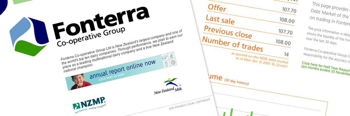
Fonterra
Size: 400+ pages
My professional status: employee at Origin Design
Website client: Fonterra
Dates: January 2001 - July 2002
Categories: Project manager, IA & UX, Website designer, Front-end developer, Content-loader, Webmaster, Old-school table layout, No CMS, Large sites
Brief: to build, develop and and maintain the website which started life as the Global Dairy Company (before Fonterra chose its name) and went through two complete re-designs before Fonterra took the project in-house. It also incorporated an intranet and a secure extranet (for externally-based contractors) and was updated every week, sometimes every day.
My responsibilities included:
- Building the main website (architecture, navigation, HTML, content layout, graphics)
- Development of site over time, including planning and carrying out upgrades and redesigns
- Development of the very large and complex archive section which housed all the public documents produced during the creation of Fonterra
- Translating long public print documents into easily manageable HTML web pages within a logical architecture (Archive section)
- Maintenance and updates - mainly the News section which was very regularly updated (sometimes daily)
- Liaison with client throughout the design process
- Creating some new graphics which followed the design of the rest of the site
- Development of the intranet, where Fonterra advertised job vacancies; and an extranet which mirrored the intranet, was password protected, and served those employees and contractors not based in Fonterra's head office
- Scheduling and creating HTML pages for hundreds of job vacancies which Fonterra advertised on its intranet for a period of about 3 months in 2002. This was a major project, with extremely tight timelines (a day to put 40 new jobs online was not unusual) and involved multiple checking and testing to ensure not a single mistake was ever made
- Project-managing the upkeep of the site and the intranet/extranet.
A well-known MP (who shall remain nameless) reckoned the first iteration of the site was the best she'd ever seen. All of the website design iterations we developed were simple in design, and the navigation was clear and straightforward. Updates were very tightly scheduled as they were timed to go live (to the minute) with media releases and press conferences.

