Grosvenor KiwiSaver
Website: in-house online forms, not available to the public - view screenshots
Size: 6-step membership signup process
My professional status: independent web designer/developer
Website client: Grosvenor KiwiSaver
Dates: October - November 2015
Categories: Scoping/pitching/quoting, Client liaison, Project manager, IA & UX, Content designer, Website designer, Front-end developer, Responsive web design/dev, CSS-based layout, CSS3, HTML5, ASP or ASP.NET, E-commerce, Small sites
Brief: Grosvenor Investment Management Limited is one of the Government's official KiwiSaver providers, with a dedicated KiwiSaver website to cater for their 94,000 members. They wanted to prototype a complete online joining/transfer process, which would initially be used by their KiwiSaver advisers, and which could be rolled out to all users on the website at a later date.
They asked me if I could help them to wireframe and design the various pages and screens that would be required (responsive design), and then to build these ready for integration by their in-house developers. I ended up working alongside the developer as we restyled his .asp forms together.
Achievements:
- Wireframing the process that had been supplied to me by the marketing manager, and suggesting ways in which this could be improved for the user, drawing on my extensive knowledge of best-practice form design
- Delivered the completed forms on-time within a very tight timeframe, and under budget
- Realising that the original plan - which was for me to do the HTML to match my new responsive design and then hand it over to the developer for integration - wouldn't be an efficient use of either his or my time. He would have needed to completely re-write my code in .asp - so instead I suggested that we let him do a vanilla build using my wireframes as reference, followed by a design session at his computer where I would help him re-style his code to match my new design. This worked out very well.
My responsibilities included:
- Providing a quote for the work
- Client liaison and some project management
- Reviewing the PowerPoint mockup of the process that was supplied to me and making initial suggestions on how it could be improved
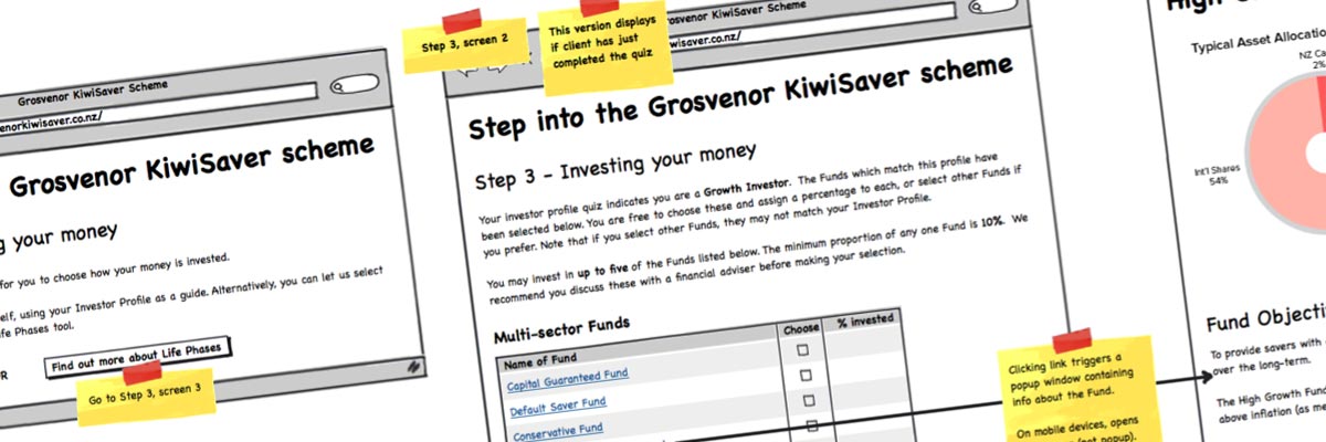
- Wireframing the process, which was made up of six separate steps, each requiring an online form on a separate page - with a total of 20 screens/popups in total
- Making improvements and suggestions for improvements to the process while I was doing the wireframes, based on my extensive knowledge of best-practice form design, and aiming to make the process as easy and straightforward for the user as possible
- Content design - re-writing the microcopy, introductory text and help text following my best-practice recommendations
- Responsive design mockups showing how the new form pages would match and fit in with the existing design of the website (although the forms would be housed elsewhere)
- Setting up the form templates using the Bootstrap grid (requested by the client) and clearing out all unnecessary styling from the Bootstrap stylesheet
- Building a relatively unstyled version of each page in HTML5/CSS3 (responsive design) as a prototype
- Meeting the Grosvenor dev team leader and discussing the best way of delivering the completed pages to their dev team - and suggesting after I found out that the site was being built in .asp that we let the developer do his thing first
- Working alongside the developer at his computer, helping to re-style his vanilla forms to match my design, sharing ideas and suggestions between us to improve the product as we went along.
This was a fun little project. I'm getting pretty good at wireframing and content design for best-practice forms - I've had a lot of practice - and I always do my best to make the process as painless as possible for the user because I know most people don't exactly enjoy filling in forms online. The better the UX, the more likely it is that your visitors will get to the end and press the "submit" button, which is what it's all about.
This is my bible when I'm doing form design - Luke Wroblewski's Web Form Design: Filling in the Blanks - I highly recommend it.

