Icebreaker
Size: 130 pages
My professional status: employee at Origin Design
Website client: Icebreaker
Dates: July 2001 - October 2003
Categories: Website designer, Front-end developer, Content-loader, Webmaster, jQuery/JavaScript, Old-school table layout, No CMS, Medium sites
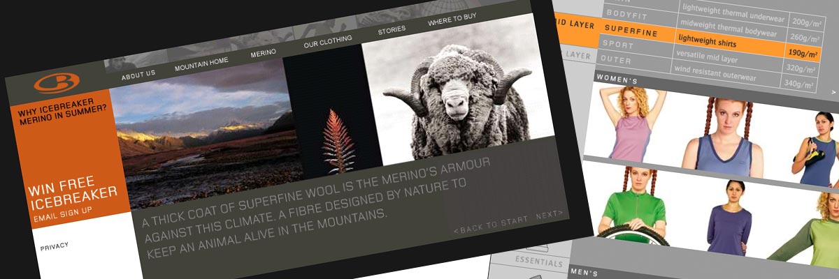
Brief: to build and maintain a website which reflected Origin's ground-breaking graphic design for Icebreaker clothing and which showcased Icebreaker's new clothing collection each season.
My responsibilities included:
- Building the site - architecture, HTML, graphics, JavaScript, CSS, popup windows
- Regular updates to the site each season, showcasing the clothing collection in its entirety
- Extensive Photoshop work for each new collection - using images from the printed catalogue (which Origin also created) and creating new display pages for the website, plus popup windows for each item, with all colour variations shown
- Creation of the Icebreaker window display sub-site, which was aimed at retailers who entered Icebreaker's display promotion
- Building the secure dealer area, which allowed retailers around the world to download Icebreaker ads and brand components
- Development, graphics and building a new Rocksocks section for the website.
This was a gorgeous site, perfectly complementing Origin's design for the print catalogue, point-of-sale and packing. I loved putting together the new product pages each season - lots of work with beautiful results.
Origin's print designs paved the way for a new style of outdoor clothing branding - which has since been copied (but in my opinion never matched) by many other clothing labels.
Awards
Best Awards 2003
Winner - Design in Business
Icebreaker was established in 1996 to make garments using Merino wool. The intent from the beginning was based upon doing what it takes to deliver an international brand. The company is relentlessly innovative. Everything is driven by the idea - the company is slave to the idea. Everything the company does is driven by the brand philosophy and values. The company is visually led, with clear diagrams and a sense of style about everything it does.

