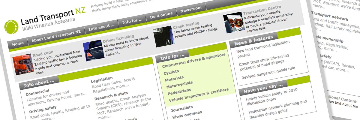
Land Transport New Zealand
Website: no longer online - view screenshot
Size: 4 Dreamweaver templates and two non-templated pages (homepage and search results), plus associated stylesheets, PHP includes and Dreamweaver library items. The entire site of over 3,200 pages was created from these elements.
Government status: part of NZ Transport Agency (NZTA), a Crown Entity
My professional status: contractor at Shift
Website client: Land Transport New Zealand
Dates: September - October 2005
Categories: Front-end developer, Govt web standards tester, Writing for the web, CSS-based layout, e-govt/WCAG compliance, Other CMS, Government websites, Large sites
Brief: to re-skin the LTNZ website following a redesign from Shift. The legacy site exhibited three different designs within its 3,200+ pages, and this project aimed to streamline these into one overall design. The client initially hoped that only the CSS would be altered, not the HTML in the templates themselves.
My responsibilities included:
- Re-development of the existing stylesheets in order to re-skin the site to match the new Shift site design
- Liaison with the client in order to achieve all their aims for the site, and to work through a range of technical and implementation issues with them
- Alteration of the PHP includes in order that they fitted the new design
- Validation of the existing Dreamweaver templates and sample pages based on the templates. This process showed that the existing pages were actually not valid in HTML 4.01 Strict. After some research and discussion with the client it was agreed that the Doctype should be changed to HTML 4.01 Transitional, in order that the templates validated. This meant changing the HTML in the templates
- Re-development of the stylesheets was sufficient to create most of the new design. However, the original template design caused some width problems in 3-column layouts. After consultation with the client it was decided to alter the HTML layout of these pages in order to solve the width issues
- The new design called for a centered liquid layout with min-width, max-width and large coloured margins on either side. This design could not be implemented without changing the HTML, so after discussion with the client it was agreed that the HTML in the templates and non-templated pages should be altered to include divs for the 800px min-width "jello-mold" technique (which forces IE Windows to display min-width). These divs were styled in the stylesheet. The max-width of 1024px was achieved using a JavaScript expression in the stylesheet
- Hand-coding in CSS and HTML 4.01 Transitional to a high level of accessibility, and following NZ e-government Guidelines
- Extensive testing of the site at all stages of the development process, ensuring complete consistency across the following browsers and platforms:
- PC: Internet Explorer 5.1, 5.5, 6,0; Firefox 1.0; Netscape 7.2; Netscape 8.0; Opera
- Mac: Firefox 1.0; Safari 1.3; Netscape 7.2; Netscape 8.0; Opera
- Ensuring that every template and stylesheet had been validated using the W3C Markup Validation Service and that it conformed to HTML 4.01 Transitional requirements
- Development of a print stylesheet
- Documentation for the client detailing the way the site had been built and the functionality of the stylesheets
- Additional client alterations once the first iteration of the new design had been handed over.
This site was an interesting challenge, partly because of its sheer size. At 3,200+ pages, an enormous CSS stylesheet, 80+ PHP includes and four different Dreamweaver templates plus two non-templated pages, it was a somewhat daunting task to get my head around the way the site worked when I initially started. The fact that the existing website was currently exhibiting three different designs and layouts also complicated the project. The timeline and budget were also extremely tight (80 hours from start to finish).
I selected a variety of pages to test on the live server, which were created using the templates. This allowed me to do the necessary alterations to the stylesheet and, later, the templates, and to check out the results without needing to test all 3,200 pages each time! :) I was pleasantly surprised (amazed actually) that so much of the re-skinning could be achieved by changing only the stylesheet - which of course is one of the aims of CSS. The client was very open to eventually changing some of the HTML in the templates in order to achieve the new design in its entirety.

