Lungfish
Size: 100+ pages, randomly selected on login
Government status: Government Agency
My professional status: contractor at Base Two
Website client: Health Sponsorship Council - Smokefree
Dates: February - August 2000
Categories: Project manager, IA & UX, Front-end developer, Content-loader, jQuery/JavaScript, Old-school table layout, Database-driven (pre-CMS), Government websites, Medium sites
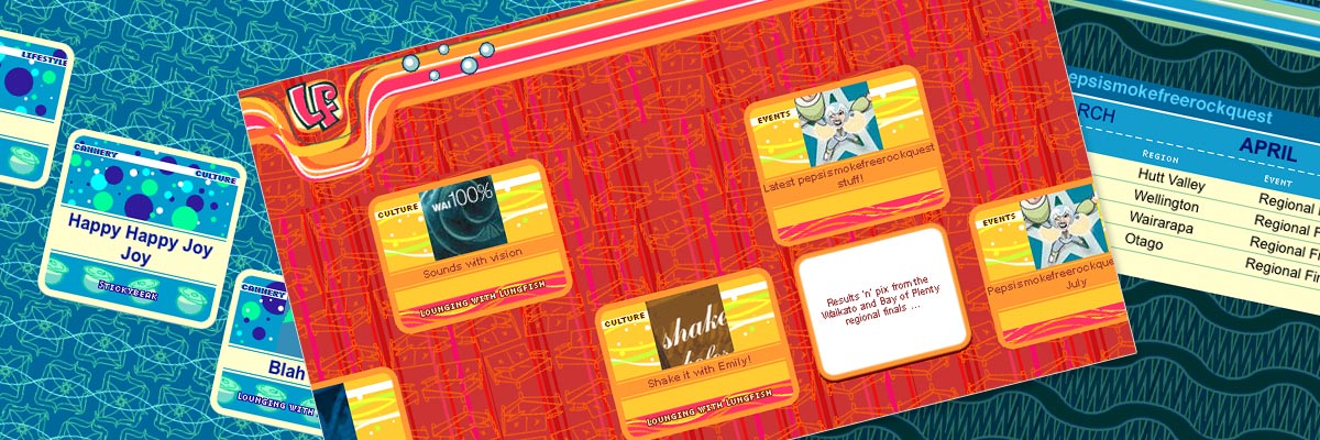
Brief: to rebrand and build the Lungfish website, targeting its market directly with a very funky, experimental and fresh image and navigation/architecture design. Lungfish is the youth brand of Smokefree New Zealand.
Congratulations!!! Lungfish looks fantastic...
Ben McFadgen, Senior Project Manager, Base Two
My responsibilities included:
- Development of navigation and architecture concepts with the Base Two team
- Building site (look & feel done by another member of the Base Two team) - frames navigation, architecture, graphics, HTML, DHTML, image maps, JavaScript, DHTML
- Close liaison with programmer who then converted HTML pages into PHP layers
- Some time management and progress planning for the team.
This was a ground-breaking site in terms of navigation and structure - we wanted to tap into the explorer mentality of young people, so we deliberately made the navigation a little bit of a challenge to find, and broke as many of the rules of "sensible" web design as we could!
There was a good deal of creative JavaScript within the site and many of the pages were designed to scroll sideways as well as down. It was a dynamic site, built in PHP from the original HTML templates with a database backend and a web-based publishing solution. The site was programmed to present random pages and colourways each time it was visited, and was continuously updated with new articles and sections.
Lungfish was a fully "stretchable" framed site, with all boxed text and graphical elements stretching to fit browser text and windows of all sizes.

