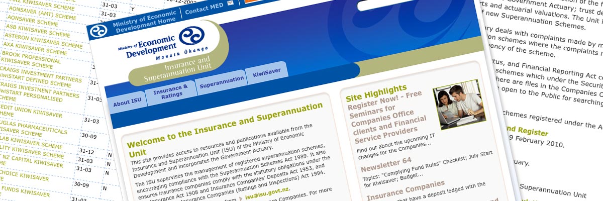
Ministry of Economic Development - Insurance and Superannuation Unit
Size: 12 template pages
Government status: Government Ministry
My professional status: contractor at Origin Design
Website client: Ministry of Economic Development
Dates: February - March 2005
Categories: Project manager, Website designer, Writing for the web, CSS-based layout, Government websites, Small sites
Brief: to create in Photoshop a series of visualisations for the Insurance and Superannuation Unit sub-site within the new Ministry of Economic Development website.
The design for the main MED site had been done by Shift, who had also supplied a set of design standards, and had mocked up a version of a sub-site content page. Origin were asked to extend the design to show how it would be applied to a range of pages in the ISU sub-site. They provided me with a series of wireframes, and I developed the design from that point, and drew up a Photoshop visualisation for each of the page templates.
Once the designs had been approved by the client I created a style guide for the developers to use.
EXCELLENT Ali - Thanks for all your hard work!
Jason O'Hara, Creative Director, Origin Design
My responsibilities included:
- Using the original design by Shift, their design standards document and Origin's wireframes to create a Photoshop visualisation for each of the following pages:
- homepage (800px and 1024px versions)
- content page (800px and 1024px versions)
- form
- table
- search page
- newsletter
- newsletter index
- contact pages (2 levels)
- subscribe page
- Ensuring that every aspect of my design followed the guidelines set out in Shift's design standards document
- Ensuring that every aspect of my design matched the style already set out for the main site
- Ensuring that the elements included in each page exactly matched the elements detailed in the wireframes
- Writing the style guide for developers once the designs had been signed off.
I really liked Shift's design, and it's always fun to develop a design, and to apply it to a range of pages or templates within a site. I've done this many times with Jason's designs at Origin - and it was great to be able to do that again in a slightly different context. I enjoy the challenge of extending a design within already-established guidelines, and to provide a pixel-perfect set of Photoshop files is something that appeals to my perfectionist nature.
Creating the style guide was also fun - as I do so much web development, it's good to be able to provide a web developer with everything I know they need to do their job efficiently.

