Office of Film & Literature Classification (2016)
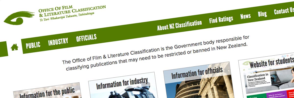
Website: classificationoffice.govt.nz (site has since been redesigned) - view screenshot
Size: 20 Dreamweaver templates for a 150-page website
Government status: Government Agency
My professional status: independent web designer/developer
Website client: Office of Film & Literature Classification
Dates: September 2015 - April 2016, with ongoing support until December 2021
Categories: Scoping/pitching/quoting, Client liaison, Project manager, IA & UX, Website designer, Front-end developer, Govt web standards tester, Writing for the web, Content-loader, Responsive web design/dev, CSS-based layout, CSS3, HTML5, jQuery/JavaScript, e-govt/WCAG compliance, Dreamweaver templates, Government websites, Medium sites
Brief: I built a new version of the Information for Students site in 2015 for the Office of Film & Literature Classification, which left their main website looking a little tired and outdated. The next project was therefore to design and build a new responsive version of the main site.
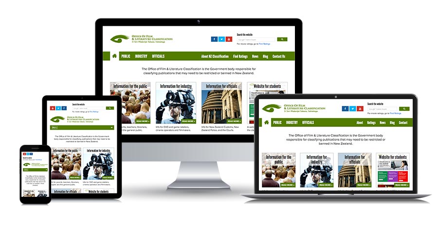
The website is aimed at anyone who's interested in classification and censorship in New Zealand - including the general public, the industry and officials who are mandated to work in this area. In addition to being responsive, the new version of the site needed to be accessible, e-govt compliant, and the design had to be friendly, helpful and trustworthy.
After I delivered the Dreamweaver templates I helped the OFLC web team with the content-loading, as they were very busy with other work. I built the site and migrated most of the content from the old site, then re-formatted it to fit the new design, editing old content and writing new content as necessary. I was responsible for the vast majority of pages on the website, and also did a QA of the site once we were ready for launch.
Ali - Thank you so much for all your work on this site (and the student site!) - your contributions have been invaluable!
Michelle Baker, Acting Information Unit Manager, Office of Film and Literature Classification
Achievements:
- Based my design on the design of the old site in order to reduce design costs, while managing to make it look fresh and new again
- Content-loaded almost the entire site as the OFLC Comms team ended up being too busy to help as much as they had planned to
- Delivered the templates on-time and on-budget - and delivered the entire completed site within a revised budget - which, considering I had based my calculations on the Students' site which is about half the size, and we'd planned for the Comms team to share the content-loading with me, was not bad going.
My responsibilities included:
- Writing a website proposal that explored the benefits of either remaining with Dreamweaver templates or moving to a full CMS such as SilverStripe, and providing costings for both - the team decided to stick with Dreamweaver templates for now
- Creation and refinement of the information architecture and site schematics, including template wireframes and sitemap, showing responsive layouts at four different breakpoints
- Project management and ongoing liaison with the OFLC team in order to achieve all their aims for the site, and to work through a range of technical and implementation issues with them
- Project management including design/development timelines within a programme of work and ensuring that I achieved all my project milestones in a timely fashion
- Responsive website design, using the existing design as my starting-point and introducing responsivity to all the template designs at a range of breakpoints
- Development of a set of 5 templates in HTML5 and CSS3, with LESS as my preprocessor, from which I created a set of 20 Dreamweaver templates which the OFLC web team would use (two of the templates required variations for each of the seven separate site sections plus utility pages)
- Hand-coding in HTML5 to a very high level of accessibility, aiming to incorporate as many WCAG 2.0 AA requirements as possible
- Incorporating dynamic graphical effects using jQuery for a range of elements including accordions and photo gallery carousels
- Programming the jQuery to provide progressive enhancement while still allowing complete accessibility for those users with JavaScript disabled
- Incorporating and re-styling Google search as our internal search engine
- Extensive browser testing of the site at all stages of the development process, across the following browsers and platforms:
- PC: Chrome (latest), Firefox (latest), Internet Explorer IE9, IE10, IE11
- Mac: Chrome (latest), Firefox (latest), Safari (latest)
- Extensive device testing at all stages of the development process, across actual devices running the following operating systems, using Adobe Edge to speed up the process:
- Android 2.2 (Froyo)
- Android 2.3 (Gingerbread)
- Android 2.3.6 (Gingerbread)
- Android 4.0.4 (Ice Cream Sandwich)
- Android 4.1 (Jelly Bean)
- iPhone 3
- iPhone 4s
- iPad 4
- Windows Phone 7
- Windows Phone 7.5
- Windows Phone 8
- BlackBerry OS 6.0
- Firefox OS
- Additional responsive testing:
- Using Firefox to emulate different device widths - every pixel width tested from 0 to 1500px
- Using Chrome to emulate a range of other hand-held devices, filling the gaps in my own device collection
- Ensuring that every template had been validated using the W3C Markup Validation Service and that it conformed to HTML5 requirements
- Building and content-loading examples of each page type containing the full range of content formatting styles so that the OFLC web editors would have examples to work from as they content-loaded the website - and demonstrating these to the web team so that they knew how to use them
- Ongoing project management once I had designed and built the templates in response to the team's requests for additional elements
- Building, content-loading, formatting and creating graphics for the vast majority of the 150 pages on the site, in most cases migrating content from the old site and re-using it, in others coding up new content
- Editing some of the old migrated content so that it worked better in a responsive context (reducing the number of words in sub-headers for example, so they didn't fill the whole screen on a mobile device) and writing drafts of some new content eg page summaries and case study summary descriptions
- Proof-reading and checking the content as I worked my way through creating and then formatting and editing the pages
- Working with the OFLC web editors to ensure that the new templates were working as expected, and to provide additional HTML, CSS and content graphics as required, including identifying where I though we needed specific new styles to suit the content, and creating these
- Creating a master Excel file that listed all the pages on the website and recorded where each was at in terms of completion across a range of 20+ criteria and who was responsible for each task - which I shared on Google docs and updated daily to track our progress towards launch
- Thoroughly testing the site from a responsive perspective once it contained the real content, and tweaking various styles and breakpoints so that it looked perfect at every possible device width, and so that elements such as dividers and backtotop links were correctly shown and hidden in different circumstances and at different widths (nothing worse than a dividing line showing up on a layout where it's not needed!)
- The creation of a sitewide CSS print stylesheet - tested in IE9, IE10, Chrome, Firefox and Safari on PC and Mac
- A final QA check of the entire website before go-live, ensuring that the site was absolutely perfect before it was put online
- Post-launch, writing a comprehensive technical hand-over document for the web team, including all the possible formatting styles and how to use them, and detailing optimum image sizes for different parts of the site.

I was so pleased to be working with the OFLC Comms team again - they are such great people - and their websites are so interesting!
This time Michelle and Henry were rushed off their feet with other tasks so, instead of sharing the content-loading job - which is what we'd originally planned to do - they pretty much left me to it.
I was really happy to be able to take over responsibility for the site for a little while and complete it for them. I've been given the freedom to use my own judgement when it came to writing summaries, separating larger old pages into multiple individual new pages, finding new images to go with the content, and generally getting everything done and completed and perfectly QA'd. I've had a great time!
Other OFLC website projects
- OFLC - info for students (2015)
- OFLC homepage (2014)
- OFLC - info for students (2010)
- OFLC website (2007)

