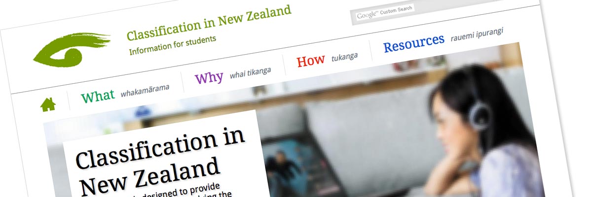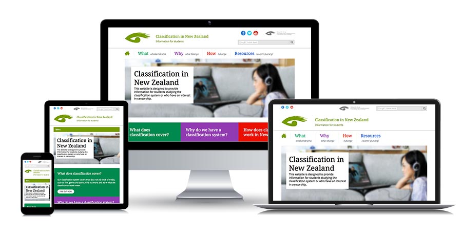
Office of Film & Literature Classification - information for students (2015)
Website: no longer online - view screenshot
Size: 14 Dreamweaver template pages for an 80-page website
Government status: Government Agency
My professional status: independent web designer/developer
Website client: Office of Film & Literature Classification
Dates: October 2014 - March 2015 and June-July 2015, with ongoing support after delivery
Categories: Scoping/pitching/quoting, Client liaison, Project manager, IA & UX, Website designer, Front-end developer, Govt web standards tester, Writing for the web, Content-loader, Responsive web design/dev, CSS-based layout, CSS3, HTML5, jQuery/JavaScript, e-govt/WCAG compliance, Dreamweaver templates, Government websites, Medium sites
Brief: the Office of Film & Literature Classification contracted a young designer to redesign this website which I had originally designed and built for them back in 2010. Following completion of the design, they decided the site should be responsive rather than static. I was invited to make the design responsive and then build the new Dreamweaver templates.
The website was aimed at students doing projects on censorship in New Zealand. In addition to being responsive, the new version of the site needed to be accessible, e-govt compliant, and the design had to appeal to young people.
A few months after I delivered the templates, I offered to help the OFLC web team finish off the content-loading, as I noticed that the site had not yet been launched. They enthusiastically agreed and I spent the next seven weeks working alongside Michelle and Henry at OFLC, working together to format the content on each page and finish building the new site - which we then launched.
Website looks awesome, super functional and clear and bright.
Classification Officer, Office of Film and Literature Classification
Achievements:
- Successfully re-jigged the design to make it responsive, while still retaining the vast majority of the original look & feel
- Delivered the templates on-time and massively under-budget, with my combined invoices for this project and the OFLC homepage being just over 50% of the amount the client had set aside for the work
- Offered to help the OFLC Communications team (who were missing a staff member at the time) to finish content-loading the website and get it launched.
My responsibilities included:
- Writing a website proposal that explored the benefits of either remaining with Dreamweaver templates or moving to a full CMS such as Silverstripe, and providing costings for both - the team decided to stick with Dreamweaver templates for now
- Creation and refinement of the information architecture and site schematics, including template wireframes and sitemap, showing responsive layouts at four different breakpoints
- Project management and ongoing liaison with the OFLC team in order to achieve all their aims for the site, and to work through a range of technical and implementation issues with them
- Project management including design/development timelines within a programme of work and ensuring that I achieved all my project milestones in a timely fashion
- Design development - taking the original files supplied by the designer and extending them in three ways - by refining the layout and placing it within a consistent grid; changing elements of the colour palette so that all colours were fully accessible in terms of colour contrast; and introducing responsivity to all the template designs at a range of breakpoints
- Development of a set of 6 templates in HTML5 and CSS3, with LESS as my preprocessor, from which I created a set of 14 Dreamweaver templates which the OFLC web team would use (two of the templates required colour variations for each of the four separate site sections plus utility pages)
- Hand-coding in HTML5 to a very high level of accessibility, aiming to incorporate as many WCAG 2.0 AA requirements as possible
- Incorporating dynamic graphical effects using jQuery for a range of elements including the homepage carousel, accordions, photo gallery carousel, and nth child classes for IE8
- Programming the jQuery to provide progressive enhancement while still allowing complete accessibility for those users with JavaScript disabled
- Incorporating and re-styling Google search as our internal search engine
- Extensive browser testing of the site at all stages of the development process, across the following browsers and platforms:
- PC: Chrome (latest), Firefox (latest), Internet Explorer IE8, IE9, IE10
- Mac: Chrome (latest), Firefox (latest), Safari (latest)
- Extensive device testing at all stages of the development process, across actual devices running the following operating systems, using Adobe Edge to speed up the process:
- Android 2.2 (Froyo)
- Android 2.3 (Gingerbread)
- Android 2.3.6 (Gingerbread)
- Android 4.0.4 (Ice Cream Sandwich)
- Android 4.1 (Jelly Bean)
- iPhone 3
- iPhone 4s
- iPad 4
- Windows Phone 7
- Windows Phone 7.5
- Windows Phone 8
- BlackBerry OS 6.0
- Firefox OS
- Additional responsive testing:
- Using Firefox to emulate different device widths - every pixel width tested from 0 to 1500px
- Using Chrome to emulate a range of other hand-held devices, filling the gaps in my own device collection
- Ensuring that every template had been validated using the W3C Markup Validation Service and that it conformed to HTML5 requirements
- Building and content-loading examples of each page type containing the full range of content formatting styles so that the OFLC web editors would have examples to work from as they content-loaded the website - and demonstrating these to the web team so that they knew how to use them
- Ongoing project management once I had designed and built the templates in response to the team's requests for additional elements
- A few months later, working alongside the OFLC Comms team members to build, content-load and format all the pages still left to do (the majority of the site), in some cases migrating content from the old site and re-using it, in others coding up new content
- Editing some of the old migrated content so that it worked better in a responsive context (reducing the number of words in sub-headers for example, so they didn't fill the whole screen on a mobile device) and writing drafts of some new content eg page summaries and case study carousel descriptions
- Proof-reading and checking the content as I worked my way through creating and then formatting and editing the pages
- Writing the description meta tag for most of the pages
- Working with the OFLC web editors to ensure that the new templates were working as expected, and to provide additional HTML, CSS and content graphics as required, including identifying where I though we could needed specific new styles to suit the content, and creating these
- Creating a master Excel file that listed all the pages on the website and recorded where each was at in terms of completion across a range of 20+ criteria and who was responsible for each task - which we shared on Google docs and updated daily to track our progress towards launch
- Thoroughly testing the site from a responsive perspective once it contained the real content, and tweaking various styles and breakpoints so that it looked perfect at every possible device width, and so that elements such as dividers and backtotop links were correctly shown and hidden in different circumstances and at different widths (nothing worse than a dividing line showing up on a layout where it's not needed!)
- The creation of a sitewide CSS print stylesheet - tested in IE8, IE9, IE10, Chrome, Firefox and Safari on PC and Mac
- A final QA check of the entire website before go-live, ensuring that the site was absolutely perfect before it was put online
- Post-launch, writing a comprehensive technical hand-over document for the web team, including all the possible formatting styles and how to use them, and detailing optimum image sizes for different parts of the site.

I really enjoy working with the OFLC team - they are such lovely people - and it was great to be invited to work on their website once again. I really like the design that their designer came up with, and I think it works very well as a responsive site.
I had a fab time working with Michelle and Henry to get the site finished and launched. The OFLC Communications Unit team was missing a team member and they simply didn't have the time to dedicate to the website, so I was really happy to be able to take over responsibility for the site for a little while and help them to complete it.
Other OFLC website projects
- OFLC website (2016)
- OFLC homepage (2014)
- OFLC - info for students (2010)
- OFLC website (2007)

