Optimation
Size: 21 template pages plus four restyled iframe pages for a 50+ page website
My professional status: independent web designer/developer
Website client: Optimation
Dates: May - November 2009, with ongoing support after delivery
Categories: Showcase sites, Scoping/pitching/quoting, Client liaison, Project manager, IA & UX, Front-end developer, Writing for the web, CSS-based layout, jQuery/JavaScript, SilverStripe, Medium sites
Brief: Optimation is a top 25 NZ ICT company that specialises in application development, managed resource services and SAP support services for medium-to-large enterprises.
The website's main purpose was to support Optimation's sales people in their relationship-building efforts by presenting Optimation as a solid and credible New Zealand-owned IT services partner and by showcasing the work the company had done and the benefits delivered for customers. Another key function of the website was to streamline and proactively manage Optimation's recruitment process.
Optimation's existing website was looking old and tired, and no longer represented the company as well as it could. In contrast to the old website, which was largely passive and not well integrated with Optimation's other marketing activities, the new site needed to work much more actively in terms of lead generation, as well as being an interactive space where customers could engage in regular conversations with the company and with each other. As Optimation's clients are busy and tend to be overloaded with information, the website had to be designed to enable them to get what they need in the minimum time possible.
Thank you Alison and team for a job well done.
Neil Butler, Executive Chairman, Optimation
My responsibilities included:
- Writing the proposal for the website fixed-price contract
- Creation and refinement of the information architecture and site schematics, including template wireframes and sitemap
- Project management and ongoing liaison with the Optimation team in order to achieve all their aims for the site, and to work through a range of technical and implementation issues with them
- Project management of the WebWeaver team (myself, Sue Quigley the designer, and developer Tom St George) including the development of design/development timelines within a programme of work and ensuring that we achieved all our project milestones in a timely fashion
- Liaison and ongoing negotiation with the branding company who were involved in the early stages of the process
- Ongoing project management once we had designed, built and integrated the website, in response to client requests for changes
- Development of a set of 21 templates in CSS and XHTML 1.0 Transitional, which Tom then integrated into the SilverStripe CMS
- Hand-coding in XHTML 1.0 Transitional to a reasonable level of accessibility
- Ensuring that every template had been validated using the W3C Markup Validation Service and that it conformed to XHTML 1.0 Transitional requirements
- Re-writing the code that was automatically generated by SilverStripe as part of the blog widget, because it failed validation - I rebuilt and restyled this generated code and Tom re-integrated it into the blog within the CMS, so that we ended up with valid code sitewide
- Incorporating dynamic graphical effects using jQuery - including programming tabbed navigation between "news" and "blogs" on the homepage, specific styling within the subnav and for the first header in the feature column, zebra-striping of the search results, re-positioning of thumbnail images coded by the CMS within a
tag, and the integration of the Shadowbox plugin on the customer case study pages
- Programming the jQuery to provide progressive enhancement while still allowing complete accessibility for those users with JavaScript disabled
- Restyling the CSS for four iframes that were embedded in the Careers section and which were managed and hosted by Resourceware International - I also had to tweak the iframe files somewhat, which are written in .asp - and as I am not a native .asp speaker, this was quite a fun exercise
- Extensive testing of the site at all stages of the development process, ensuring complete consistency across the following browsers and platforms:
- PC: Internet Explorer IE6, IE7, IE8; Firefox, Opera, Chrome
- Mac: Firefox, Opera, Safari
- The creation of a sitewide CSS print stylesheet, which was thoroughly tested in all our supported browsers
- Doing a QA and proof-read of the entire site once it had been content-loaded, writing a report on what needed to be fixed, and using this as the basis for a day-and-a-half of training/web editing with the staff member at Optimation who had been tasked with inputting the content while we were building the site
- Ongoing support for the web editor as she learned to use SilverStripe
- Ongoing liaison with the Optimation web team, to ensure that the new templates and backend functionality were working as expected, and to provide additional HTML, CSS and content graphics as required.
This was a three-person job - I did the initial quote, information architecture, site schematics, ongoing project management and client liaison, Sue did the design, then I did the HTML and CSS, testing, QA, training and ongoing support. Tom integrated my templates into SilverStripe and programmed all the site functionality, as well as running an initial training session prior to content-loading.
We were all very proud of this site – it achieved all of the client's requirements in a usable and aesthetically-pleasing manner, and at the time it was one of the best examples of a SilverStripe website that we had designed and built. In fact we were so proud of it that we entered it into three separate categories for the 2010 ONYAs awards - Best Use of HTML/CSS (me), Best Visual Design (Sue) and Best Corporate Content (Amanda McVitty, who wrote all-new content for the entire site).
The following is an excerpt from one of our entries:
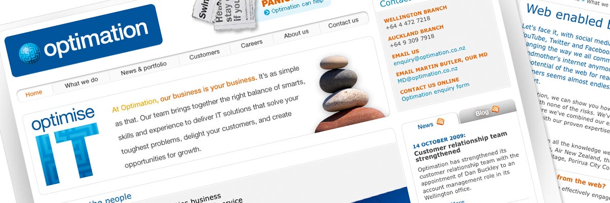
It's an interesting challenge to design a website for an IT company. It would be easy to stick to the "slightly geeky corporate business" style, but the client didn't want that, and neither did we.
We needed to leverage the existing branding from their previous site, but inject some new energy and excitement and revamp the dated look. Optimation were very interested in moving away from the corporate look and towards something a little younger, fresher and funkier, but without frightening away any of their corporate clients in the process. The site also needed to be extremely straightforward, clean and intuitive to use. They didn't want their busy clients having to learn how to use the website before they would be able to find what they were looking for.
All information on the site had to be easily accessible, with related information in other sections of the site also easily accessible, whatever page you were currently in. We achieved this through the use of the "related" links in the feature column, which are automatically generated by the CMS using keywords.
Sue created a set of "promo accents" that sit in the header next to the Optimation logo to highlight hot topics and inject visual interest. These promos, particularly the "blog" and "careers" accents, are deliberately fresh and on the funky side to contribute to the younger and more contemporary look without compromising the content or freaking out corporate clients. We also wanted to bring in some people imagery to put a human touch to IT, one more thing lacking in the previous site design.
One of Optimation's aims for this website was to promote the company to potential employees and contractors as the place to work in IT, a "talent magnet", and they felt it was important that the design portray the company as an exciting, enthusiastic and cool place to work. There is also a promo slot set aside for the current seasonal campaign so that Optimation's marketing initiatives are consistent across all platforms including print, web and more.
It was also extremely important to Optimation to showcase successful case studies on the home page to create more awareness of their expertise and talents. Sue created a feature area to celebrate the success of recent projects. This area has a strong visual element unique to each case study to draw users in and create visual interest. Case studies rotate through on refresh so that return users are exposed to more great examples upon each visit to the site.
The new site design remains true to the official Optimation blue colour palette - but injects new energy and warmth with the introduction of orange and yellow accent colours. All typography has been revamped with a more contemporary look and feel while delivering optimal legibility and usability. Sue has updated the visual treatment of their corporate brand images so they gel well with the new site design, and has made her own design decisions in terms of borders, shading, shapes, backgrounds etc – as the existing branding documentation provided virtually no guidance in these areas. The overall design is based on Optimation's existing branding, but has brought it right up to date, and taken the "look" far away from the old design.
Awards
Finalist, Best Use of HTML and CSS - ONYAs web awards 2010

The Optimation website is a good example of quality HTML markup and CSS.
The Best Use of HTML and CSS category is sponsored by SilverStripe.
The ONYAs celebrate those who design, develop and create New Zealand's best websites and applications. They're awards by the industry, for the industry. I was completely thrilled to be nominated twice in this category - for the Optimation website, and for the Environmental Protection Authority website.
Best Use of HTML & CSS - Webweaver Productions for Optimation from Webstock on Vimeo.

