Northern Gateway Toll Road
Size: 9 template pages
Government status: Crown Entity
My professional status: contractor at Shift
Website client: NZ Transport Agency
Dates: June - July 2009
Categories: Front-end developer, Govt web standards tester, CSS-based layout, e-govt/WCAG compliance, Other CMS, Small sites
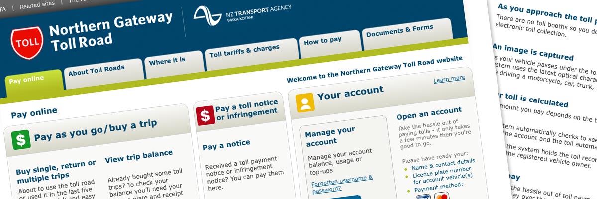
Brief: to build a set of template pages for the new Northern Gateway Toll Road website. The site provides detailed information about the new Toll Road and how to use it, and allows regular users of the road to open and manage an online account through which they can pay their tolls.
It also enables drivers to buy individual or multiple trips online, or pay a toll notice or infringement, as well as keeping visitors up-to-date with road conditions.
Hi Ali ...so this will basically mean they can go wild with words and all the box heights in total will be aligned even if the shaded header areas get staggered like your screen shot? Oh joy!
Jen van der Zwet, Project Manager, Shift
My responsibilities included:
- Development of the site in CSS and HTML 4.01 Transitional, which would then be integrated into a Content Management System
- Responsible for ensuring that the design passed the new e-govt accessibility standards - which meant that I had to ask for some aspects of the design to be re-done, for example where colour combinations failed the luminosity contrast ratio test
- Hand-coding in HTML 4.01 Transitional to a high level of accessibility - including ensuring that the site was still fully usable with images turned off
- Extensive testing of the site at all stages of the development process, ensuring complete consistency across the following browsers and platforms:
- PC: Internet Explorer IE6, IE7, IE8; Firefox
- Mac: Firefox, Safari
- Ensuring that every page and stylesheet had been validated using the W3C Markup Validation Service and that it conformed to HTML 4.01 Transitional requirements
- Development of print stylesheets sitewide.
The design has a number of interesting aspects, particularly the use of multi-column elements in the homepage that contain variable amounts of content where each column must appear to be exactly the same height - and where the action buttons had to appear at the same level in different boxes, regardless of the amount of content above. I had to do quite a bit of re-drawing of the homepage in order to make the boxes exactly the same width ratio as each other, and to ensure that the gaps between boxes were all consistent and that each curved corner was structured in exactly the same way. It's details like this that can lift a design if they're correct, and can diminish the overall feel of the site if they are not attended to.
Shift asked me to oversee the e-govt compliance aspects of this site, because when the site was built they hadn't designed any e-govt sites using the new rules (although they'd done plenty using the old rules). I used the Juicy Studio luminosity contrast ratio tool to assess the colours of both text and backgrounds, and we tweaked the design in various places so that all colour pairings passed the contrast test. I also make sure that I built the site in such a way as to allow visitors to use the site even when images are turned off.
The project was an interesting challenge because the majority of the content was not written until after I had built the site. This meant that I had to ensure that my HTML could accommodate any amount of content, and wouldn't break even if there was much more or much less text than had been used by the designer in his mockups.

