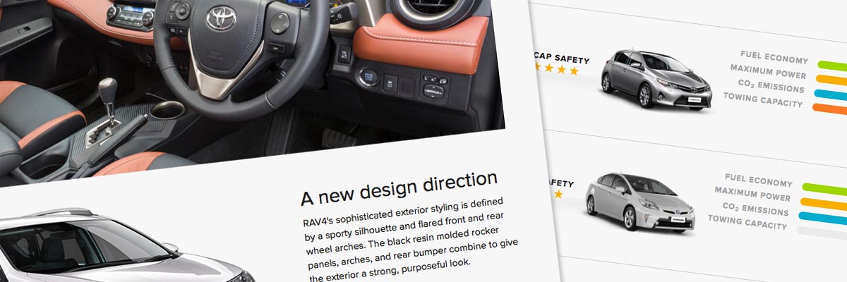
Toyota New Zealand
Size: 29 page templates and modals
My professional status: contractor at Proximity
Website client: Toyota New Zealand
Dates: May - June 2013
Categories: Front-end developer, CSS-based layout, CSS3, HTML5, jQuery/JavaScript, Other CMS, Large sites
Brief: the Toyota New Zealand website was in need of a major upgrade and Proximity was invited to design and build it for them, as the two companies already had a very good working relationship.
I was asked to join the small web team for six weeks to carry out the front-end development for the site. I was responsible for the HTML5 and CSS3/SASS coding for the new designs, as well as accessibility and browser testing.
Achievements:
- Successfully delivered the completed set of HTML/CSS templates, being the third or fourth front-end developer to work on this project, and improved the consistency of both the design and the HTML/CSS coding at the same time
- Solved some really quite tricky design challenges by thinking outside the box and coding my own solutions in HTML/CSS.
My responsibilities included:
- Building 29 page and modal templates in HTML5 and CSS3 (using SASS as my preprocessor), including sample content and unique layouts for each template - as well as the chrome, background layers, headers, banners, footer and navigation elements for the entire website
- Using HTML5 Boilerplate with the standard 12-column 960 grid as a starting-point for the front-end dev - a couple of pages had already been put together by different front-end developers when I took over the project
- Using SASS to define global colour variables, grid settings and various other mixins which were then referenced in the main stylesheet
- Using the MyFonts webkit to render the non-websafe font chosen for the overall site design (Proxima Nova) as well as styling the fallback web-safe alternatives
- Using the Eric Meyer reset stylesheet to provide better cross-browser consistency in the default styling of HTML elements
- Hand-coding (using Sublime Text 2) to a reasonable level of accessibility
- Ensuring that all styles were logically grouped within the appropriate stylesheet, to make ongoing use as easy as possible for the Proximity web team
- Coding a small amount of demo jQuery for dynamic graphical effects including popup containers and accordions, using Modernizr, a JavaScript library that detects HTML5 and CSS3 features in the user's browser - the devs in the team then re-wrote my jQuery to incorporate it into the main site
- Creating styles that would allow the jQuery to provide progressive enhancement while still allowing complete accessibility for those users with JavaScript disabled - and styling the no-js version of these elements to match the design
- Using icon fonts for repeated graphics wherever possible (we had a set made especially for the website) and sprites where icon fonts weren't available
- Incorporating various CSS3 effects within my stylesheets including box-shadow, border-radius, RGB and RGBa opacity and text-shadow, and ensuring that old browsers such as IE8 (which has patchy support for CSS3) still looked nice and worked without them
- Extensive testing of the site at all stages of the development process, and ensuring consistency across the following browsers and platforms; using VirtualBox to host the range of test PC operating systems and browsers required:
- PC (WindowsXP): Internet Explorer IE7, IE8; Firefox (latest)
- PC (Windows7): Internet Explorer IE9, IE10, Chrome (latest)
- Mac (OS X 10.6): Chrome (latest), Firefox (latest), Safari (latest)
- Ensuring that all my templates were validated using the W3C Markup Validation Service and that they conformed to HTML5 requirements
- Setting up a local version of the site templates on my Mac using MAMP so that I could view the pages properly using my Mac as a server, and so that my colleagues could access my work and integrate it into the test version of the CMS
- Committing my updates to the main branch using Terminal commands (with the help of my more geeky colleagues - thanks Jeff!)
- Taking part in progress meetings with the rest of the web team, and adding/changing design/HTML elements identified in these meetings.
This was such a fun project to work on - the Proximity web team are an awesome group of people, and we had a great time working together. Proximity is the web arm of the Clemenger ad agency, and it was really interesting to work within that type of environment for the first time.
I think I was something like the third or even fourth front-end developer to work on the templates for this project - the other three having not gotten very far on the project for various reasons - so one of my first jobs was to review the HTML and CSS already written and make it as consistent as possible. This matters to me both as a perfectionist but also in terms of ease of use and expansion going forward - it's always best to work with consistent code. This extended to flagging a few small inconsistencies within the design, and getting these updated by the project's new designer.
There were some quite interesting effects on the website - like the sticky selector on the specifications template that appeared at the top of the screen once you reached a certain point on the page. That was fine, but the shadows around different elements and combined elements that could be turned on and off using the selector were surprisingly tricky to build. I particularly enjoyed the challenge of the multicoloured bars in the vehicle explorer template - all done with multiple layers of CSS and controlled with JavaScript written by Jeff to draw each coloured bar to the appropriate length. I always love a design/build challenge to get my teeth into.
The end result was a pretty cool set of templates that made up a really stylish website. It was a far cry from Toyota's old site - and well worth the wait!

