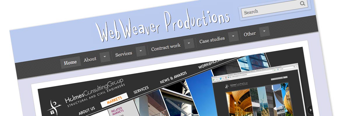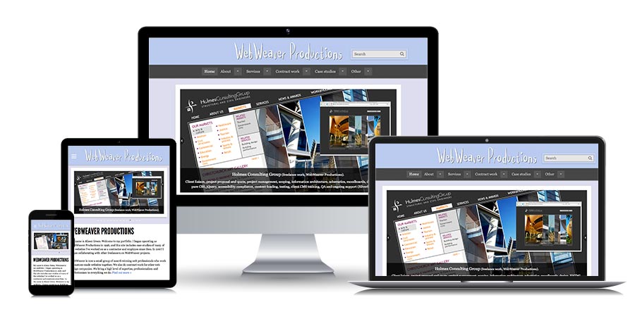
WebWeaver Productions
Website: webweaver.co.nz (site has since been redesigned) - view screenshots
Size: over 300 pages
My professional status: independent web designer/developer
Website client: me
Dates: August 2013 - April 2015 onwards until September 2024
Categories: Showcase sites, Project manager, IA & UX, Content designer, Website designer, Front-end developer, Govt web standards tester, Writing for the web, Content-loader, Webmaster, Responsive web design/dev, CSS-based layout, CSS3, HTML5, jQuery/JavaScript, e-govt/WCAG compliance, SilverStripe, Large sites
Brief: to design and build myself a website which would advertise my web design and other skills. My two target markets for this site are design companies looking for contractors or permanent staff, and small to medium-sized companies looking for someone to build them an excellent website with the minimum of fuss. It also functions as a portfolio site, providing a history of my web design and development work since 1996.
Achievements:
- Launched this site after quite an extensive period of development - your own site always gets put aside when paid work comes in - I was determined to get the jolly thing finished so that I could showcase my responsive design abilities
- Worked hand-in-hand with my developer Tom St George to produce the best, most complex SilverStripe site we've done so far - and figuring out a whole bunch of new functionality that we can now offer to our clients as well
- Encouraged Tom to look at a performance issue that was bothering me - especially in the large category pages - which resulted in an extraordinary improvement in download speed - from really-rather-slow to lightning speed on some pages - once he had installed SilverStripe's Static Publisher module.
My responsibilities included:
- Information architecture and wireframing
- UX design
- Content design
- Web design, including responsive web design
- Front-end development and HTML5, CSS3 (using LESS as my pre-processor) and jQuery
- Web standards, e-govt and accessibility compliance (because it's a good place to develop my skills, and because all websites should be fully accessible, not just government ones)
- Writing and editing content
- Content-loading
- Extensive browser testing of the site at all stages of the development process, across the following browsers and platforms:
- PC: Chrome (latest), Firefox (latest), Internet Explorer IE8, IE9, IE10
- Mac: Chrome (latest), Firefox (latest), Safari (latest)
- Extensive device testing at all stages of the development process, across actual devices running the following operating systems, using Adobe Edge to speed up the process:
- Android 2.2 (Froyo)
- Android 2.3 (Gingerbread)
- Android 2.3.6 (Gingerbread)
- Android 4.0.4 (Ice Cream Sandwich)
- Android 4.1 (Jelly Bean)
- iPhone 3
- iPhone 4s
- iPad 4
- Windows Phone 7
- Windows Phone 7.5
- Windows Phone 8
- BlackBerry OS 6.0
- Firefox OS
- Amazon Kindle
- Additional responsive testing:
- Using Firefox to emulate different device widths - every pixel width tested from 0 to 1500px
- Using Chrome to emulate a range of other hand-held devices, filling the gaps in my own device collection
- The creation of a sitewide CSS print stylesheet - tested in IE8, IE9, IE10, Chrome, Firefox and Safari on PC and Mac
- Ensuring that every template had been validated using the W3C Markup Validation Service and that it conformed to HTML5 requirements
- QA and proof-reading
- Webmaster
- Everything else apart from integration into SilverStripe - which was done by Tom St George

In April 2015 I launched a total re-design and re-build of my portfolio website. The design is completely new and it's now a responsive design/build in CSS3 and HTML5, with LESS as my pre-processor, designed for ease of reading in whatever device it's being viewed on. In addition, for the first time, the site is being managed via the SilverStripe CMS, integrated by my WebWeaver programmer Tom St George.
It's been a fun exercise, beginning with the responsive design (which I always love doing). I find it endlessly fascinating to design websites in a responsive way - where should the main nav go, how shall we re-arrange the layout and what should our breakpoints be, how do we deal with tables, what are we going to put in the footer - all that kind of stuff. I design and build mobile-first, and for this site I used 320 and Up by Andy Clarke as my starting-point. I used the Responsive Grid System to set up my grids, and customised these to fit a range of breakpoints determined to a large extent by the content itself.
My main nav is an off-canvas design that slides in from the side in smaller devices, and is based on a design by David Bushell, that I extended to include dropdown menus off the main nav in wide viewports and nested subnav lists in the off-canvas version (both triggered by click, not hover).
I have used rems throughout for my font sizing, and have set up a mixin that calculates this from a standard pixel-value in the CSS, automatically adding a pixel fallback version for IE8. I use a range of other mixins for things like clearfix, box-shadows, box-sizing, transitions, and hiding elements in various ways.
I've included two different techniques for responsive tables, as there were quite different display requirements for tabular data in different parts of the site. The table in my Career snapshot page uses the stacktable.js technique by John Polacek, which creates a copy of the table converted into a 2-column key/value format for smaller screens. The table in my Case studies (text version) page has more columns and doesn't really work with the Stacktable solution, so I used the Filament Group's RWD Table Patterns technique which, although now retired, still works very well. Columns are selectively hidden if the viewport is too narrow to contain them, and all columns can be shown or hidden by the user, using a set of checkboxes in an accordion at the top of the table. I have adapted both solutions to fit my needs within the site, and re-styled each solution to match my design.
I've used the same clueTip JavaScript code that I had in my old site, because I really like it - and I've adapted it for older mobile devices that don't respond properly to the JavaScript by styling the clueTip page created in these older devices as well as the tooltip that shows up in newer ones.
The responsive lightbox that I use for screenshots on case study pages is Magnific Popup by Dmitry Semenov. It's a really well-built responsive solution, and it's also accessible, which was very important to me. I've restyled it to match the rest of the site. The carousel on the homepage is an adaptation of the Basic jQuery Slider by John Cobb. Again, it's responsive and accessible, and I've adapted it for my site, both in terms of functionality and design.
The integration into SilverStripe has been a really interesting experience - because it's the first time I've used a CMS on my own website. I love coding by hand, so I never wanted one before, but I was enticed by the range of functionality that a CMS could provide, particularly in terms of being able to categorise and sort my case studies in different ways.
I've pushed Tom to the limit with the things I've wanted the site to be able to do, which he's enjoyed because he says I've really made him think. I'm amazed at how much he's been able to automate, that I was expecting to code by hand - including the compilation of the tables in Career snapshot and Case studies (text version), the content of each of the category pages and the testimonials page - it's really brilliant. He's also been endlessly patient with my change requests - of which there have been many.
Tom has also focused on optimising the download speed of the website - so important with mobile-friendly websites - and we are using SilverStripe's Static Publisher module to achieve lightning-fast download speeds with this server-side caching tool.
I've been reminded of how easy it is to change one's mind once you see a thing in action, and how often you come up with new ideas once something is "finished". It's why we're always happy to make changes for our clients and add functionality during the website build - because we recognise that you don't always know exactly what you want until you start to see it take shape.
I tried out pretty much every single grid system and every Bootstrap stylesheet in the process of building this site; it's taken far too long to get finished (20 months!) because I kept having to put it aside to do "real" work (as you do); and every time I had to proof-read my 200 case studies again I'd wonder why I don't just have one of those portfolios that show my 5 best pieces of work instead. It's been a fun ride!
I'm really pleased with it - and next week I'll be re-jigging the homepage design and adding a new field to all the case study pages... because it's an ever-changing, ever-improving thing, and that's how it should be.

