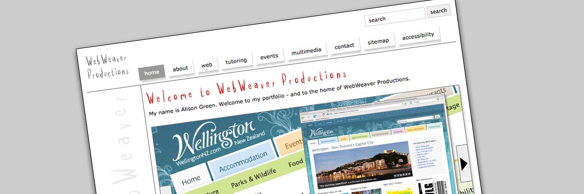
WebWeaver Productions (2000-2015)
Size: 320 pages
My professional status: independent web designer/developer
Website client: me
Dates: September 2000 - April 2015
Categories: Project manager, IA & UX, Content designer, Website designer, Front-end developer, Govt web standards tester, Writing for the web, Content-loader, Webmaster, CSS-based layout, jQuery/JavaScript, e-govt/WCAG compliance, No CMS, Large sites
Brief: to design and build myself a website which would advertise my web design and other skills. My two target markets for this site were design companies looking for contractors or permanent staff, and small to medium-sized companies looking for someone to build them an excellent website with the minimum of fuss. It also functioned as a portfolio site, providing a history of my web design and development work since 1996.
My responsibilities included:
- Information architecture
- Content design
- Web design
- Front-end development - HTML, CSS and jQuery
- Hand-coding in Dreamweaver, using templates and library items so that I could easily update it and make alterations
- Web standards, e-govt and accessibility compliance (because it's a good place to develop my skills, and because all websites should be fully accessible, not just government ones)
- Writing, editing and proof-reading content
- Content-loading
- Browser testing
- PC: Internet Explorer 6.0, 7.0, 8.0; Firefox; Opera
- Mac: Firefox; Opera; Safari
- Everything else
- Client liaison - I'm pretty easy to deal with - and I'm always around!
I built my first WebWeaver website in 2000, a whole 4 years after first becoming a web designer! My only defence is that I was busy building websites for other people up until then.
The first site was built using tables (of course) and the design was simplicity itself. A couple of dividing lines separating navigation and content, with colour-coded main sections for ease of use, and that was it. I was all about the content - and I wanted the case studies to shine, rather than being overpowered by an in-your-face design. I like white space and clean designs, so that's what I used on my own site.
In mid-2005 I spent three weeks completely re-building the website - removing the tables and instead using CSS to lay out and format the content. This was my first pure CSS website, and I taught myself the rudiments of CSS by using my site as a practical project. I seem to recall browser-testing it and making it work perfectly in (amongst others) IE5.01 and IE5.5 for PC, and IE5.2 for Mac - now that was a nightmare of a browser!
I did all this to impress the people at Shift with my ability to teach myself this specific new skill that I knew they wanted. It worked - I ended up spending the next two and a half years at Shift - first as a contractor, and then as a full-time employee.
At the end of 2009 I did a quick re-design, achieved by changing the CSS only - and there have been many other iterations of this site over the years. Sometimes I would revisit the site after a few weeks or months and something would be out of date, or I'd have decided I didn't like the design any more. So I would change or update it. Again. That's the joy of having your own website I suppose - it's an ongoing, ever-changing entity - and it also gave me a chance to try out new design ideas and techniques.
The final pure CSS iteration before my complete re-design in 2015 was built to New Zealand e-government accessibility standards in validated HTML 4.01 Transitional.

