Zumo Coffee
Size: 11 page templates
My professional status: independent web designer/developer
Website client: Zumo Coffee Roasters
Dates: February 2013
Categories: Scoping/pitching/quoting, Client liaison, Project manager, IA & UX, Content designer, Responsive web design/dev, E-commerce, Small sites
Brief: Zumo is a coffee roasting company and coffee house based in Nelson. I was approached to put together a quote for an online web application which would allow Nelsonians to order their cup of Zumo coffee via their smartphone, tablet or desktop computer, ready for pickup/takeaway, in-house enjoyment or home delivery.
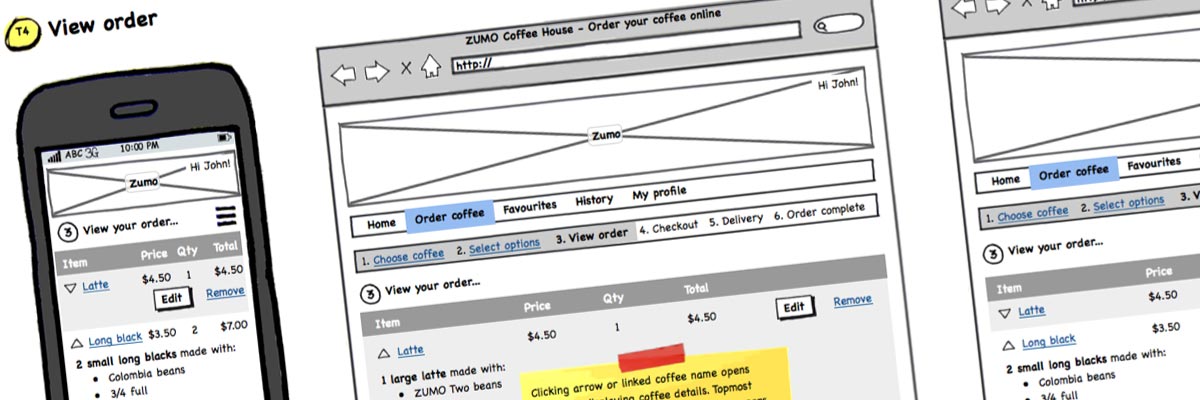
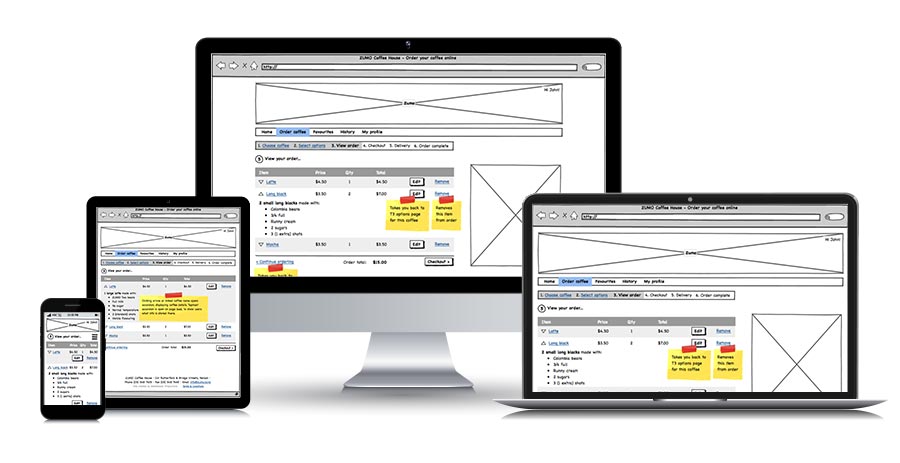
As part of the quote, I put together a full set of wireframes to demonstrate the responsive layout, the web app's functionality, and the ordering process itself; across the 11 templates that I had identified as being necessary for the app to function as required. This included doing the content design for the whole application.
The project was put on hold shortly after I delivered my wireframes, but I'm including it in my portfolio because it was a great piece of work!
Achievements:
- Reviewed the coffee-ordering process in detail and broke this down into a series of steps, carried out the content design for each step, then successfully developed a set of wireframes that reflected that process and translated it into a set of web pages for the client
- Incorporated responsive design into the wireframes - the first time I had done this on a sitewide scale.
My responsibilities included:
- Putting together a fixed-price quote for the project
- Figuring out, developing and doing the content design for the coffee ordering process, as follows:
- registration/login
- selecting a coffee type (eg latte, long black etc)
- choosing specific options within that coffee type (size, milk, bean etc)
- reviewing order
- checkout
- delivery options (have here, takeaway, or delivery)
- order confirmation
- Using Balsamiq to compile the information architecture (a full set of wireframes, process recommendations and documentation) for all parts of the website, including the screens detailing the coffee ordering process; as well as screens for favourites, history, and user profile; and general content pages
- Including in these wireframes the layouts for responsive design, demonstrating different layouts at various breakpoints for mobile, tablet and desktop for each template
- Project management and client liaison.

This was an interesting project that never quite happened. I really enjoyed thinking through and putting together the process for coffee ordering - I love that kind of process-driven logical thinking where the needs of the user are paramount and where you have to work through every microscopic detail of the process in order to get it right - it really suits my detail-oriented brain.
It was also one of my earliest responsive designs, where I started to get my head around the challenges of arranging content on different devices with different sizes of viewport. Heaps of fun - and even if we never get to use it for this particular client, it's never wasted effort because of what we've learned and figured out along the way.

