
Responsive design and development
Ah the joys of responsive design! I completely love it - it's a challenge, and a new thing to learn, and a constantly evolving and developing set of techniques and technologies.
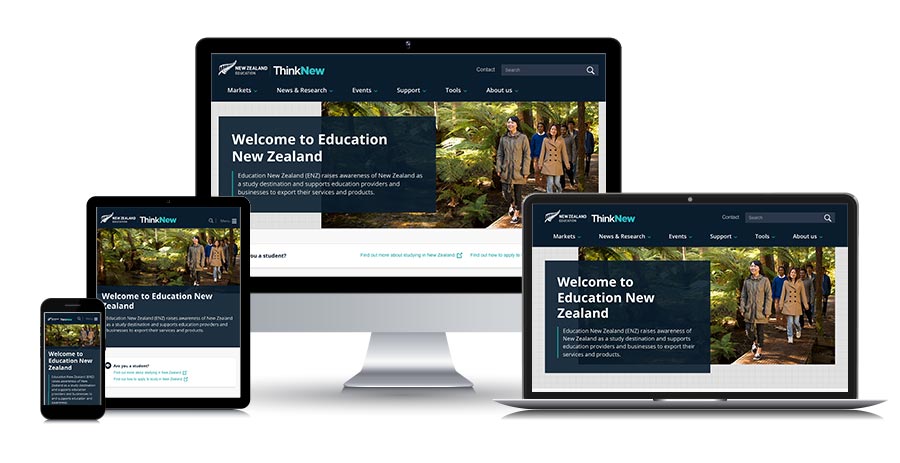
Education New Zealand - responsive front-end dev contract with Touchcast
Of course we're way past the tipping point in terms of responsive design - and clients expect a website that responds to the device in which it's being viewed. I find that being able to combine UX design, visual design and front-end development is a real advantage when it comes to responsive web design and development, particularly as I tend to do much of my responsive design in the browser, as HTML.
Until fairly recently I focused on getting my websites looking as close to exactly the same in different browsers as I possibly could, but since the advent of CSS3 and responsive design I've become more relaxed about that. I can still build down to IE6 if you really want me to (although why would you want me to?!), but tend to draw the line at IE9 for responsive sites.
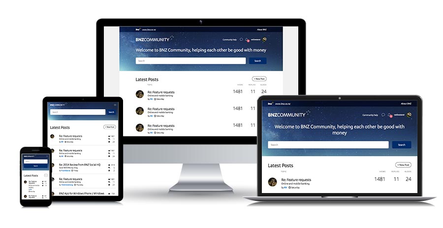
BNZ Community - responsive front-end dev contract at BNZ Bank
Ali - thanks for all your help on the Community project. A challenging one but great to get it nailed. Your input was really appreciated.
Russell Mildon, Project Manager - Online Sales, BNZ Digital
One of the things I really enjoy about responsive design is getting the details right. I love working out how to rearrange content in different device widths, and working out where to set my breakpoints, using standard breakpoint settings as a starting-point but being guided to a large extent by the content itself.
I love deciding which responsive techniques would work best for the tabular data on this particular website, and the main navigation, and what shall we do with the subnav, and what's going in the footer...
All that stuff is so much fun - and I find it begins in the wireframing, is developed during the design phase, and reaches its peak once I'm in the browser and building the templates - because only then can you actually see the site doing its responsive thing. I use a mobile-first approach because that makes perfect sense to me, and I believe in providing everything you'd get on a desktop, in a mobile - you just have to rearrange it and test the heck out of it.
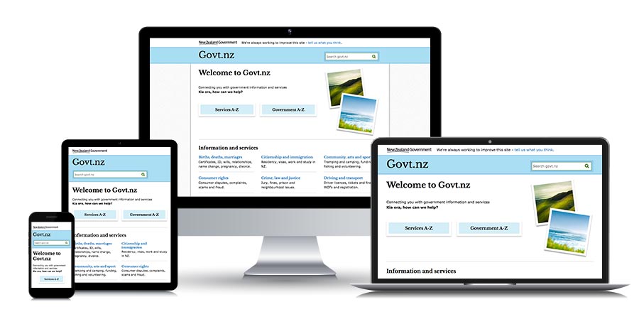
Govt.nz website for DIA - responsive UX/IA, responsive design, responsive front-end dev contractor
Alison - Thank you so much for your careful, considered work in a complex and difficult environment - with daggers coming at you from all sides! You opened up conversation around design in a way that was never possible previously. You are excellent at taking a 'non-precious' approach to your work while simultaneously being able to calmly argue your point.
You're very good at what you do and I'd hire you again in a heartbeat. Thank you. Stay in touch.
Jared Gulian, Govt.nz project lead, Department of Internal Affairs
I have a shoebox full of old mobile phones I've bought off TradeMe to do my responsive website testing because I firmly believe it's always best to test on real devices. I reckon if it works in the old Blackberry Bold and the Samsung Galaxy 5 running Android 2.1 and the LG C900 Optimus 7Q with Windows 7 and my iPhone and new iPad and the Samsung Galaxy S III and the ZTE Open running the Firefox OS, as well as a pile of other devices - then I'm probably doing OK.
On my desktop I also use the Firefox Web Developer toolbar for a quick overview of breakpoints, and Firefox "inspect element" for a detailed examination of all possible browser/device widths. Once I'm happy with the website in those environments I switch to BrowserStack. To me, it's worth its weight in gold, especially when I think back to the hoops we used to have to jump through to test our websites in different operating systems back in the old days.
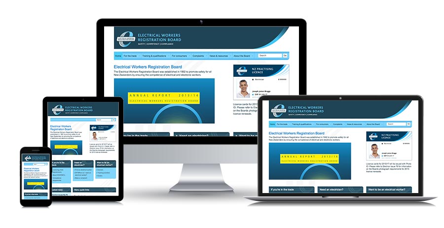
Electrical Workers Registration Board for MBIE as a contractor with Insight Consultants - responsive UX design, responsive web design development, responsive front-end dev
Thanks for the update Ali, I've been enjoying the stream of one way messages regarding bugs and fixes... It is just about impossible for people without a deep knowledge of the product to QA this part of the task as you are doing, but without this discipline the end result is disappointing.
Today more so than ever before you have made good on my confidence to engage specialist services. Keep up the good work. Maximum respect.
Simon Wagg, Senior e-Business Advisor, Ministry of Business, Innovation & Employment
I'm really lucky to live in Wellington and to have been to every Webstock conference bar one. This means I've attended full day and half-day workshops run by some of the web's leading responsive design experts, including Ethan Marcotte (Responsive Web Design) and Jeremy Keith (Responsive Enhancement) in 2012, Karen McGrane (Content Strategy for Mobile) in 2013, Josh Clark (Designing for Touch) and Brad Frost (Everything You Wanted to Know About Responsive Design...And Less!) in 2014, Derek Featherstone (Responsive Design and Accessibility) in 2015, and Luke Wroblewski (Mobile Design Now) in 2016. It means I've been able to learn from the best, at the same time as teaching myself and ensuring that I'm keeping up with developments in the field of RWD.
I remember sitting in Ethan Marcotte's workshop in 2012, feeling slightly concerned that I was a slightly late adopter of RWD and that I was going to be left behind in the rush of front-end devs who could already do this thing.
I needn't have worried. Pretty much everyone at the workshop was in the same boat as me, and as I listened to Ethan discussing break points and liquid layouts ("oh hang on - I was doing those way back in 2005-2006 - before designers decided they preferred fixed-width 1024px websites...") and responsive images ("wait - I remember figuring out the 100% wide thing for images years ago...") and then later, experimenting with content order on post-it notes with Jeremy Keith - I remember thinking "Yes, I can do this - and it all makes perfect sense..."
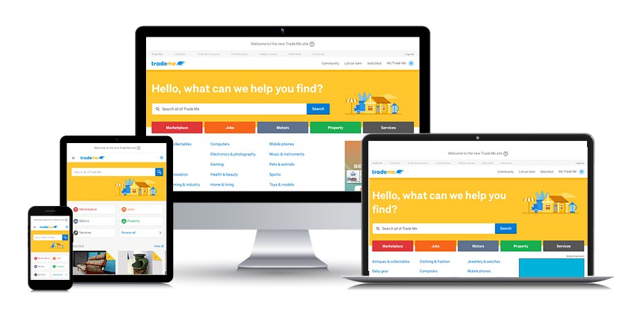
TradeMe - front-end dev contractor for six months, helping to get their new responsive website ready for launch
DIA Marketplace
I am an approved supplier for DIA Marketplace in the Consultancy and Professional Services (Digital Experience Professional Services channel) - under the following categories:
- Information Architecture
- User Insight
- Visual Design
- Front-End Development
- Content Design.
